Author: jatin.creatrix@gmail.com

  • Design system vs style guide: what to build first (and why most teams overbuild)

    Design system vs style guide: what to build first (and why most teams overbuild)

    Design system vs style guide: what to build first (and why most teams overbuild)

    Most product teams ask us for a design system when what they actually need is a tighter style guide and a small pattern library. The terms design system vs style guide get used interchangeably, so by the time someone says “we need a design system,” they often mean six different things. Some want consistent buttons. Some want a Figma library. Some want governance. The result is a six-month project that solves the wrong problem.

    In our experience running design system setup engagements for SaaS teams, the right starting point depends on your team size, product surface area, and how often your UI changes. We’ll walk through what each one is, where they overlap, and when investing in a full design system actually returns the time and money it costs.


    Layered illustration comparing a style guide to a design system

    What a style guide actually covers

    A style guide is documentation. It tells your team how the brand should look and sound when applied to a UI: colors, typography, spacing rules, logo usage, voice and tone, button styles. It is a reference, not a product. You read it. You don’t install it.

    For most early-stage SaaS teams, the first useful artifact is a style guide. It locks down the visual language so designers stop debating shades of blue and developers stop guessing at padding. A good style guide includes:

    • Color tokens with hex or HSL values and a clear use case for each (primary, secondary, error, surface)
    • A type scale with sizes, weights, and line heights
    • A spacing system based on a 4 or 8 px grid
    • Iconography rules (size, stroke, color)
    • Voice and tone guidelines for microcopy and product writing

    What a style guide doesn’t cover: how a button behaves when it’s loading. How a modal stacks above a toast. How a date picker handles invalid input. Those are interaction patterns and component states. Style guides describe; they don’t ship.


    IMAGE: design-system-vs-style-guide-section-1.png

    ChatGPT prompt: Flat editorial illustration of an open style guide document showing color swatches, a type ramp, and spacing rules. Clean white background, minimal icons, accent blue (#0038FE) and warm orange star highlight (#F5A623), 16:9.

    Alt text: Style guide document showing colors, typography and spacing rules


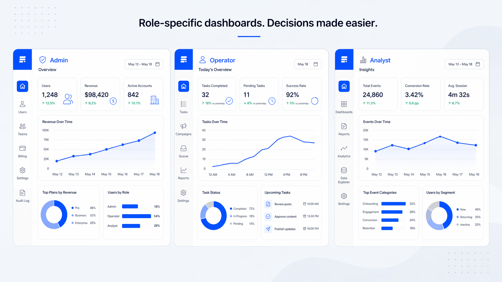
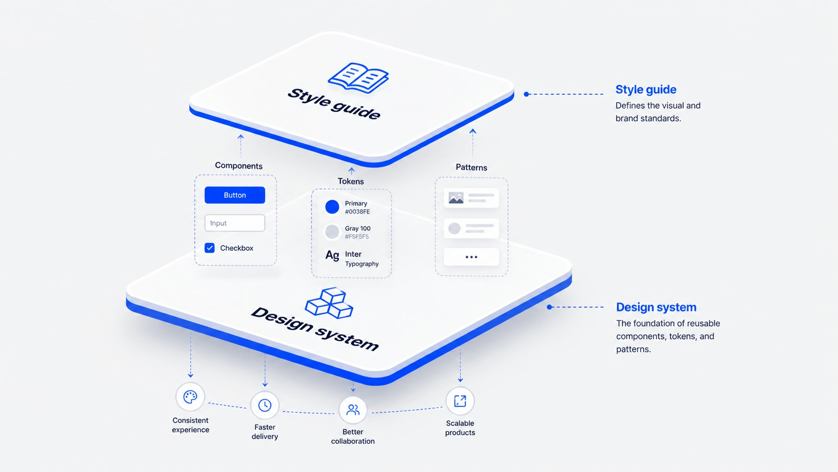
    What a design system actually covers

    A design system is a product. It contains everything in a style guide, plus the working pieces of your UI: coded components, interaction patterns, accessibility rules, contribution guidelines, and a process for keeping it all in sync between Figma and your codebase.

    A real design system has four layers, the same way our team structures every Design System Setup engagement: Tokens → Components → Patterns → Usage rules.

    • Tokens.The lowest level. Colors, type, spacing, motion, radius, defined as variables in Figma and in code.
    • Components.The buttons, inputs, cards, modals. Each one has documented states, props, accessibility behavior, and code snippets.
    • Patterns.How components work together to solve a recurring problem (a paginated table with empty, loading, and error states, for example).
    • Usage rules.When to use what, when to break the system, and how to propose changes.

    The difference is who uses it. A style guide is read by designers and content people. A design system is consumed by developers building features at speed. If your engineers can’t pull a <Button variant=”primary”> straight from a library and ship it, you don’t have a design system yet. You have a style guide with extra steps.


    IMAGE: design-system-vs-style-guide-section-2.png

    ChatGPT prompt: Diagram of a four-layer design system stack labeled Tokens, Components, Patterns, Usage rules, drawn as nested rounded rectangles. Minimal line style, accent blue (#0038FE) for the active layer, near-black (#171717) text on light grey (#F5F5F5) background, 16:9.

    Alt text: Four-layer design system structure: tokens, components, patterns, usage rules


    The real difference between a style guide and a design system

    The cleanest way to think about it: a style guide is a document; a design system is a product. The Nielsen Norman Group makes the same call. A design system is the “parent” that contains the style guide as one of its children, alongside pattern and component libraries.

    Three differences matter for product teams.

    1

    Audience

    Style guides serve brand and content. Design systems serve product engineering. The same color value lives in both, but the way it’s expressed (a swatch in a PDF vs. a CSS variable referenced by a Button component) is what tells you which one you have.

    2

    Lifecycle

    Style guides get updated when the brand changes. Design systems are updated continuously, the same way any internal tool is, with releases, deprecations, and contribution PRs.

    3

    Scale

    A style guide can govern one website or one app. A design system is what you reach for when you have multiple products, marketing sites, and internal tools that all need to feel like the same company.

    If you’re a five-person team with one app and one marketing site, you don’t need three of those layers yet. You need the first one.


    IMAGE: design-system-vs-style-guide-section-3.png

    ChatGPT prompt: Side-by-side comparison illustration. Left card titled “Style guide” with a document icon and a person reading. Right card titled “Design system” with a stack of UI components and a developer pulling code. Minimal flat style, accent blue (#0038FE), light grey background (#F5F5F5), 16:9.

    Alt text: Side-by-side comparison of a style guide and a design system


    When a style guide is enough, and when you’ve outgrown it

    We tell early-stage clients to start with a style guide and a small reusable component library, not a full design system. A style guide is enough when:

    • You have one product surface (one web app, or one marketing site, or one mobile app)
    • Your team is fewer than 8 people across design and engineering
    • Your UI doesn’t change weekly
    • Speed to market still beats long-term standardization

    You’ve outgrown the style guide when:

    • Two designers are building the same component slightly differently in three places
    • Engineers ask “is there a date picker we already use?” more than once a sprint
    • A designer leaves and the new one can’t find the source of truth
    • Onboarding a new engineer takes longer than fixing the bug they were hired for

    That’s the inflection point. It’s usually 12 to 18 months into product development, around the time the team grows past 8 to 10 people. [HUMAN INPUT NEEDED: insert a specific 16pixel SaaS client example where this transition happened (e.g., RecurPost or Upmetrics) and what the trigger looked like.]


    IMAGE: design-system-vs-style-guide-section-4.png

    ChatGPT prompt: Editorial illustration of a small startup team (3 people) working at one screen on the left, and a larger product team (8+ people) on multiple surfaces (web, mobile, dashboard) on the right. Clean flat style, accent blue (#0038FE) highlights, light background, 16:9.

    Alt text: Small team versus larger product team needing different design tooling


    When a design system pays for itself

    A design system is an investment, not an aesthetic upgrade. It pays back in three ways.

    • Engineering speed.Fewer cycles spent rebuilding the same component. In our work, [HUMAN INPUT NEEDED: insert a measured engineering-time saving from a 16pixel design system project (e.g., RecurPost or Upmetrics) with the percentage gain or hours saved], the team shipped feature work faster after the system was in place.
    • Cross-product consistency.When marketing, product, and a help center all share tokens and components, brand recognition compounds. Users don’t have to relearn UI patterns when they move between surfaces.
    • Easier hiring.New engineers and designers ramp up against documented components instead of tribal knowledge.

    You should consider building one when you have multiple products or surfaces, distributed teams that ship in parallel, and a growth plan that involves more features without more inconsistency. If those three things aren’t true yet, a style guide plus a 10-component library will hold you for another year. For SaaS teams specifically, our work on SaaS UI/UX design usually starts with that lighter layer first.


    IMAGE: design-system-vs-style-guide-section-5.png

    ChatGPT prompt: Illustration of a balance scale weighing “design system investment” (stacked components, code icons) against “engineering speed and consistency gains” (clock, growth chart). Minimal flat style, accent blue (#0038FE), warm orange (#F5A623) for the gains, light grey background, 16:9.

    Alt text: Balance scale showing design system investment versus speed and consistency gains


    How to grow from a style guide into a design system without rewriting everything

    The mistake most teams make is treating the move as a “design system project,” a six-month rebuild with a separate budget and a separate team. We’ve found the cleaner path is incremental, following our Design System Setup flow: Tokens → Components → Patterns → Usage rules.

    1

    Start with tokens

    Pull the values out of your style guide (colors, type, spacing) and store them as design tokens in Figma variables and in code. This is a one-week job for a small product.

    2

    Code your top 10 components

    Audit your product. Find the ten components that show up most often (usually Button, Input, Card, Modal, Tabs, Table, Toast, Tooltip, Avatar, Badge) and build them once with proper states and props.

    3

    Document each component’s states and props

    Loading, disabled, error, hover, focus, empty: every state. This is what separates a UI kit from a design system.

    4

    Add patterns as you build features

    Don’t try to define every pattern upfront. Capture them when feature work creates a reusable solution (the first paginated table becomes the table pattern).

    5

    Set governance after the system is in use

    Contribution rules, naming conventions, and review processes only matter once people are actually using the system.

    Most teams can run this over two quarters without freezing feature work. [HUMAN INPUT NEEDED: insert a 16pixel example of a phased design system rollout and the team size it was run with.]


    IMAGE: design-system-vs-style-guide-section-6.png

    ChatGPT prompt: Step-by-step roadmap illustration showing 5 milestones (Tokens, Components, Documentation, Patterns, Governance) along a curved path. Minimal line style, accent blue (#0038FE) markers, light background, 16:9.

    Alt text: Five-step roadmap from style guide to a working design system


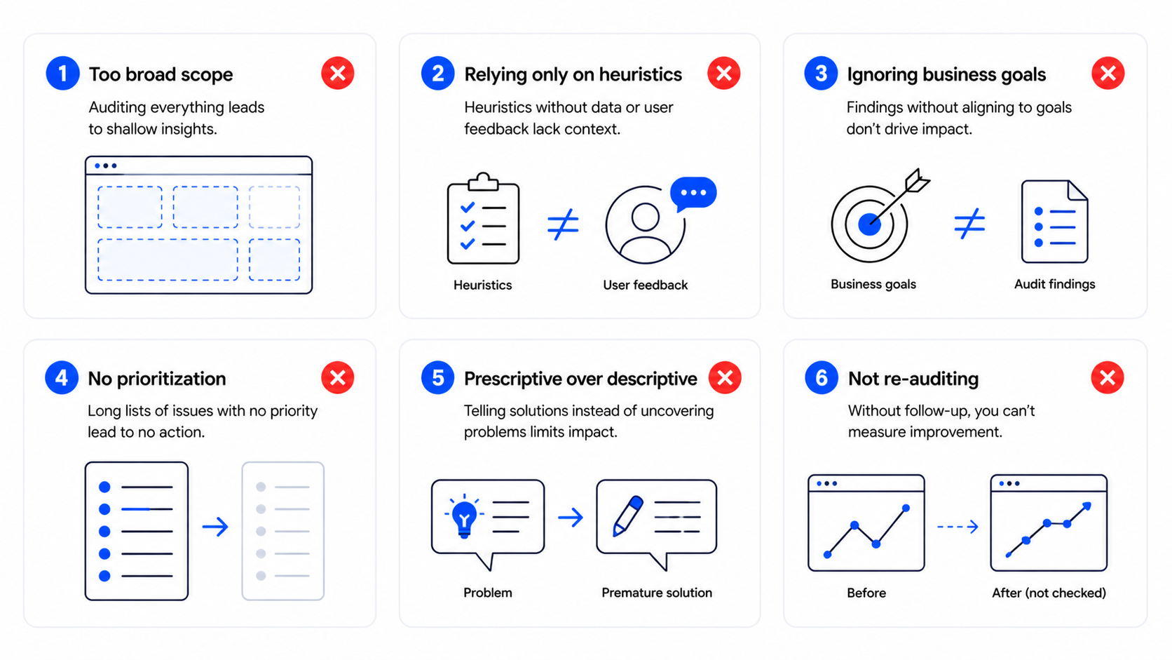
    Common mistakes teams make when picking between the two

    A few patterns we see across [HUMAN INPUT NEEDED: insert number of design system or style guide projects 16pixel has shipped]:

    01

    Building a full design system before a real product exists.

    If your product hasn’t found its shape yet, the system you build will codify the wrong patterns. Start with tokens and a small component set, then formalize once the product stabilizes.

    02

    Calling a Figma library a design system.

    A Figma library is a UI kit. If your engineers aren’t pulling from a matching code library, your designers and developers will drift apart within a quarter.

    03

    Treating it as a one-time project.

    Design systems decay the same way codebases do. If nobody owns it after launch, it’s fossilized inside six months.

    04

    Skipping the style guide step.

    Some teams jump straight to coded components without locking down tokens first. The components inherit the inconsistency, and you end up rewriting them later.

    05

    Hiring a contractor to “do” the design system in isolation.

    Without a product team adopting it, the system never gets used. The people building it should be the people who’ll live with it.


    IMAGE: design-system-vs-style-guide-section-7.png

    ChatGPT prompt: Five small flat illustrations arranged in a grid representing common mistakes: a half-built product, a Figma file alone, a fossilized component, a leaning tower of components, and a contractor working in isolation. Accent blue (#0038FE) and warm orange (#F5A623) highlights, light grey background (#F5F5F5), 16:9.

    Alt text: Five common mistakes when choosing between a style guide and a design system


    FAQ

    Is a UI kit the same as a design system?

    No. A UI kit is a collection of design files, usually in Figma, that designers can drag and drop. A design system includes the UI kit plus tokens, coded components, documentation, accessibility rules, and a process for keeping all of it in sync. A UI kit is one input into a design system, not the system itself.

    Can a small startup skip the style guide?

    We don’t recommend it. Even a one-page Notion document with your colors, type, and spacing rules saves hours every week and prevents the “everyone picks their own grey” problem. A lightweight style guide takes a day to write and removes a year of small disagreements.

    How long does it take to build a design system?

    For a single SaaS product, a working v1 (tokens, 10 to 12 components, basic documentation) takes about 6 to 8 weeks with one designer and one engineer working part-time. Patterns and governance add another quarter. A “full” design system across multiple products is usually 6 to 9 months of phased work, not a single project.

    Who owns a design system once it’s built?

    A small team, usually one designer, one engineer, and a product manager part-time. Without an owner, nobody fixes drift, and the system becomes another piece of internal documentation nobody reads. If you can’t name the owner, you’re not ready to build it yet.

    What’s the difference between a pattern library and a design system?

    A pattern library is a collection of reusable design solutions, like how a search-with-filters works or how an empty state behaves. It’s one layer inside a design system, the layer between individual components and full features. You can have a pattern library without a full design system, and many teams do.

    Should we use an open-source design system instead of building our own?

    For most early-stage products, yes. Tools like shadcn/ui, Radix, or Material, paired with your own tokens and a thin custom layer, get you 80% of the way without the cost of a custom system. Build your own only when your product has unique interaction needs that off-the-shelf systems can’t handle.

    Ready to figure out what your team actually needs?

    If you’re not sure whether your team needs a style guide, a small component library, or a full design system, the answer usually shows up in a 30-minute audit of your product surfaces and team size. We help SaaS teams scope the right level of investment so you don’t overbuild, and so what you build actually gets used.

    If your inconsistency problem is rooted upstream of the system itself (in user flows or information architecture), a UX audit is the better starting point. Otherwise, talk to our team about a scoped engagement and we’ll help you pick the right shape for where your product is today.

  • Mobile app navigation patterns: how to pick the right one (without guessing)

    Mobile app navigation patterns: how to pick the right one (without guessing)

    Mobile app navigation patterns: how to pick the right one (without guessing)

    Most teams start a mobile app navigation conversation in the wrong place. They pick a tab bar versus hamburger debate before they’ve finished their information architecture. By the time the first screen ships, the navigation is fighting the product instead of supporting it.

    After redesigning navigation for [HUMAN INPUT NEEDED: confirm number, suggestion: “20+”] mobile apps across SaaS, fintech, and consumer products, we keep seeing the same pattern. Teams shop for navigation styles instead of designing the structure underneath them. The hamburger versus bottom tabs question is almost always a symptom of unclear IA, not a real design decision.

    This guide breaks down the eight mobile app navigation patterns we actually use, when each one fits, and a four-step process for picking the right one for your product. No screenshot zoo, no pros-and-cons tables that read like Wikipedia. Just what we’ve learned from shipping real navigation across products like RecurPost, World 11, and Bruno’s Barbers.


    Three mobile app screens showing different navigation patterns

    The mistake most teams make with mobile app navigation

    The mistake is treating navigation as a UI question. It isn’t. Navigation is the visible output of your information architecture, and if the IA is fuzzy, the nav will be too.

    Here’s what we see almost every time a team comes to us with a “navigation problem”. They’ve got twelve features. They picked a bottom tab bar early because it looked clean. Now there are five tabs, the fifth one is “More”, and “More” hides everything users actually came to do. The team thinks the fix is switching to a hamburger menu. It isn’t.

    A clean UI is not equal to good UX. A bottom tab bar can look great and still hide the three actions that drive activation. The real fix is going back to the IA: what are the destinations users move between, how often, and in what order. Once that’s clear, the pattern almost picks itself.

    In our experience, the teams that get mobile navigation right do one thing first. They list destinations, not features. A destination is a place the user goes to do something repeatedly. A feature is anything you’ve shipped. Most apps have far fewer destinations than features, and that gap is where the cleaner nav lives.


    Comparison between feature-based and destination-based mobile navigation

    The 8 mobile app navigation patterns we actually use

    These are the patterns we reach for. Not every pattern that exists, just the ones that do real work in shipping products.

    Bottom tab bar

    A persistent bar at the bottom of the screen with three to five primary destinations. The standard for almost every consumer-grade app on iOS and Android, including Instagram, Spotify, and most banking apps.

    When it works: the product has three to five destinations users move between regularly, and the destinations are roughly equal in importance. This is the safest default for SaaS apps with a clear core loop.

    When it breaks: the product has more than five top-level destinations and you start jamming “More” tabs in. That’s a signal to rethink IA, not to add another tab.

    Hamburger menu (drawer)

    The three-line icon, usually top-left, that slides out a list of options. Common in productivity tools, email clients, and apps with a long tail of secondary actions.

    When it works: as a secondary nav for settings, account, help, and rarely-used sections. Pairing a hamburger with a bottom tab bar is what NN/g calls a “combo” pattern, and it’s used in roughly 86% of cases where hidden navigation is involved.

    When it breaks: as the only navigation. Hidden nav cuts engagement roughly in half because users don’t open what they can’t see. If your primary destinations live behind a hamburger, expect lower retention.

    Top tab bar (segmented control)

    A row of tabs at the top, often used inside a destination to switch between views (like “Posts / Reels / Tagged” on a profile page).

    When it works: switching between filtered views of the same content. Two to four tabs is the sweet spot.

    When it breaks: when teams use it as primary navigation. Top tabs are hard to reach with a thumb on a 6.7-inch phone, which is most of the market now.

    Bottom sheet

    A panel that slides up from the bottom of the screen. It can be persistent (a permanent peek) or modal (triggered by an action). Maps apps and music players use this heavily.

    When it works: surfacing contextual actions or content without leaving the current screen. Great for product detail views, filters, and quick actions.

    When it breaks: when used as a substitute for a real navigation hierarchy. A bottom sheet is for actions on the current view, not for moving between sections.

    Gesture-based navigation

    Swipes, edge gestures, and long-press as primary interactions. Used heavily in iOS for back navigation and in apps like Tinder where the gesture is the product.

    When it works: when the gesture maps to a real-world metaphor users already understand (swipe to dismiss, swipe to delete, pull to refresh).

    When it breaks: when you build a hidden gesture with no visual affordance. Users won’t discover it, and the ones who do will forget. Gestures should support navigation, not replace it.

    Floating action button (FAB)

    A circular button hovering above the content, used for the single most important action in the app. Material Design’s signature pattern. Gmail’s compose button is the classic example.

    When it works: when there’s one action that’s clearly more important than everything else and is taken from many screens. Compose, create, post.

    When it breaks: when teams stuff three FABs into one screen, or use it for a secondary action. One FAB, one job, or skip it.

    Search-led navigation

    Search as the primary way to find content, often with a prominent search bar at the top of the home screen. Used in apps with deep catalogs, like ecommerce, streaming, and travel.

    When it works: when users come in with intent and the catalog is too large for category browsing. If your catalog has more than a few hundred items, search needs to be a first-class destination.

    When it breaks: when search is hidden behind an icon and used as a fallback. If users need search, give it real estate.

    Priority+ pattern (overflow)

    Show the most important nav items, hide the rest behind a “more” button that expands or opens a sheet. A way to keep a tab bar at five items while still surfacing access to the long tail.

    When it works: when you genuinely have a long tail of secondary destinations and you want the primary five to stay clean. Pairs well with a bottom tab bar.

    When it breaks: when “More” becomes a dumping ground and the items behind it never get touched. If 30% of your users never tap “More”, the items there might not need to exist at all.


    Eight mobile app navigation patterns shown side by side

    Bottom tab bar vs hamburger menu: when each one wins

    This is the most-searched mobile navigation question we get, so it’s worth answering directly.

    The short answer: use a bottom tab bar for primary destinations users hit often. Use a hamburger menu for secondary nav users hit rarely. In most apps, you’ll use both.

    The longer answer is about visibility. A bottom tab bar keeps three to five destinations always visible. A hamburger menu hides everything behind one icon. The trade-off is screen space versus discoverability, and discoverability almost always wins for the actions that matter.

    Here’s how we pick between them on real projects:

    Use a tab bar

    when the product has 3-5 clear core destinations and users return to them often. Examples: a SaaS dashboard with Home, Inbox, Library, Settings; a fintech app with Accounts, Transfer, Cards, Profile.

    Use a hamburger

    when most of the app is one core destination and the rest is settings, help, account, and edge cases. Examples: a focused content tool, a single-purpose calculator, a CMS-style editor.

    Use both

    when you have 3-5 primary destinations and a long tail of secondary nav. This is most apps once they scale. Tab bar for the primary, hamburger for the rest.

    The mistake most teams make is using a hamburger as primary navigation because they couldn’t decide what was important. A hamburger is not a way to avoid prioritization. If you can’t pick five primary destinations, that’s a product clarity problem, not a navigation one.


    Bottom tab bar versus hamburger menu comparison

    How to pick the right navigation pattern in 4 steps

    THE 4-STEP UX AUDIT PROCESS01List your List your dest02Group by fGroup by frequ03Map the prMap the primar04Decide wheDecide where t

    Here’s the process we run before picking a pattern. It usually takes a couple of hours for a single product and saves weeks of redesign later.

    1

    Step One

    List your destinations, not your features

    A destination is a place the user goes to do a recurring job. A feature is anything you’ve shipped. Write down every destination in your app on one piece of paper. Most teams find they have far fewer than they thought.

    For a typical SaaS product, this might be: Home, Library, Create, Inbox, Settings. Five destinations. Notice that “Create” is one entry, not seven, even if you have seven different create flows underneath it.

    2

    Step Two

    Group by frequency of use

    For each destination, mark how often a typical user hits it. Daily, weekly, monthly, or rarely. This data should come from analytics, not opinion. If you don’t have data yet, base it on the jobs the user is hiring your product to do.

    The destinations users hit daily or weekly are your primary nav candidates. Monthly and rarely belong in secondary nav.

    3

    Step Three

    Map the primary 3-5 to a pattern

    Take your daily and weekly destinations. If there are three to five of them, a bottom tab bar is your default. If there are one or two, you might not need a primary nav at all, just a single screen with smart in-context actions.

    If there are six or more, that’s the IA signal we mentioned earlier. Either two of them are actually the same destination wearing different hats, or you’re confusing features with destinations again. Go back to step one.

    4

    Step Four

    Decide where the secondary nav goes

    The monthly and rarely destinations don’t disappear. They go in a hamburger, a settings drawer, or a profile menu. The rule is: secondary nav should be reachable in two taps from any primary destination, but it shouldn’t compete for attention with the primary five.

    This four-step process maps to the design decisions we make on every project. It also forces the conversation upstream into IA, where the real decisions live.


    Four-step process for picking a mobile app navigation pattern

    iOS vs Android: navigation conventions to follow (and break)

    Both platforms have hardened conventions. Following them gets you 80% of the way to good navigation for free, because users already know how the controls work.

    For iOS, the conventions are: tab bar at the bottom, back gesture from the left edge, modal sheets that slide up, and a navigation bar at the top with title and optional left/right actions. Apple’s Human Interface Guidelines lay this out clearly, and breaking from it usually costs more than it gains.

    For Android, the conventions are: bottom navigation bar (Material 3 has officially moved away from top tabs as primary), system back via gesture or button, and a top app bar with title and actions. Material Design’s guidance has converged with iOS over the last few releases, which is why most cross-platform apps now look broadly similar at the navigation layer.

    The places where breaking convention is okay are usually brand-led products where the navigation is part of the experience. A meditation app with a single circular control instead of a tab bar can work, because the product is about focus. A banking app with a custom gesture-based menu cannot, because users are anxious and need predictability.

    A practical baseline we use on every project: minimum tap target of 44 points on iOS and 48 dp on Android, label every nav item (icon-only nav loses on accessibility and discoverability), and keep nav placement consistent across screens. Different nav per screen breaks the user’s mental model of where they are.


    iOS and Android navigation conventions side by side

    Common mobile app navigation mistakes (and how to fix them)

    Five mistakes we see almost every audit. Each one is fixable without a rewrite.

    1. Five tabs and one of them is “More”. The “More” tab is a sign your IA hasn’t been finished. The fix is to merge two real tabs into one (often Settings + Profile) and promote the most-used item out of “More” into the primary five. If “More” still feels needed, switch to the priority+ pattern with a clear overflow icon.

    2. Hamburger as the only navigation. Engagement on hidden nav drops off fast. The fix is to identify your top three to five destinations and pull them into a bottom tab bar. Leave the hamburger for everything else. We’ve seen this single change move daily active engagement double-digit percentages on products we’ve audited.

    3. Inconsistent nav across screens. A bottom tab bar on the home screen, no tab bar on the detail screen, a different nav on the settings screen. Users lose their sense of place. The fix is to keep the primary nav visible across all main screens. Hide it only on full-screen flows like onboarding or checkout.

    4. Hidden gestures with no affordance. A swipe-from-the-edge action that nobody finds. If a gesture matters, give it a visual hint, at least on first use. A small chevron, a tutorial overlay, or a subtle bounce animation. Hidden gestures with no affordance get used by less than 5% of users in the testing we’ve done.

    5. Tap targets that are too small. Cramming five tabs plus icons plus labels into a thin bar. The fix is to either drop a tab or drop the labels. We don’t recommend dropping labels, so usually it’s the tab. If your tab bar feels cramped, your IA is over-stuffed.

    If you’re seeing two or more of these in your product, it’s worth running a focused UX audit on the navigation surface specifically. The fixes are usually smaller than the redesign your team is bracing for.


    Five common mobile app navigation mistakes and fixes

    How to test if your mobile navigation actually works

    Picking a pattern is half the work. Validating it is the other half. Here’s the testing stack we use, in order of cost.

    Tree testing comes first. Strip the visual design out and test just the IA structure. Tools like Treejack or Maze let you give users a task (“find your billing info”) and see how they navigate the structure. If they fail at the tree level, no amount of UI polish will save the navigation.

    First-click testing comes next. On a static screen, ask users where they’d tap to do a specific job. If more than 30% click the wrong place, the labels or icons are misleading. NN/g research on first-click accuracy shows it’s one of the strongest predictors of overall task success, so it’s cheap, fast, and worth running early.

    Time-to-task on the top three user goals is the closest thing to a real-world measurement. Time how long it takes users to complete the three most common tasks in your app. If any of them take more than 10-15 seconds of navigation time, you have a discoverability problem. Users who can’t find what they’re looking for in that window typically abandon.

    Session recordings are the cheapest signal once the product is live. Watch ten users hit the navigation in real use. You’ll see hesitations, wrong taps, and moments where someone opens a hamburger and immediately closes it. Those are the gaps your IA didn’t anticipate.

    A note on metrics: don’t use raw engagement on a nav item as a signal of success. A tab might be tapped a lot because users keep landing there by accident. Always pair engagement with task completion to know whether nav is helping or hurting.


    Mobile app navigation testing workflow showing tree test, first-click test, and session recordings

    FAQ

    What’s the best mobile app navigation pattern for a SaaS app?

    For most SaaS apps, a bottom tab bar with three to five primary destinations plus a hamburger or profile menu for secondary nav is the safest default. Tab bar handles the daily and weekly destinations, hamburger handles settings, billing, account, and edge cases. The exact split depends on your IA, not your app type.

    How many tabs should a bottom navigation have?

    Three to five. Below three, a tab bar is overkill, and you can usually get away with a single home screen plus contextual actions. Above five, the targets get too small and users start tapping wrong icons. If you have six destinations that all feel primary, two of them are probably the same destination in disguise.

    Is the hamburger menu still acceptable in 2026?

    Yes, as secondary navigation. It’s no longer acceptable as primary navigation for any app where engagement matters. Hidden nav cuts engagement roughly in half because users don’t open what they can’t see. Pair it with a bottom tab bar for primary destinations.

    What’s the difference between a bottom tab bar and a bottom sheet?

    A bottom tab bar is persistent navigation between top-level destinations. A bottom sheet is a contextual panel that slides up to surface actions or content related to the current screen. Both live at the bottom, but the tab bar is for navigation, the bottom sheet is for actions.

    Should mobile apps follow iOS or Android navigation conventions?

    Both. If you’re shipping on both platforms, follow each platform’s native conventions where it matters: tab bar position, back gestures, sheet behavior. The shared layer (your screen layouts, component design, content) can be consistent. The platform layer should match user expectations.

    How do I know if my mobile app navigation is failing?

    Three signals: time-to-task is over 15 seconds for top user goals, support tickets complain about “can’t find” things, or session recordings show users hesitating or backing out of the nav frequently. Any one of those is enough to run a focused navigation audit.

    Ready to fix your mobile app navigation?

    Most navigation problems we see are IA problems wearing a UI costume. The fix isn’t a new pattern, it’s a sharper structure underneath. If your team is debating tab bar versus hamburger, that’s usually a sign the question one level up hasn’t been answered yet.

    We’ve done this work for products at every stage, from pre-launch MVPs to scaled SaaS apps. If you’re sitting on a navigation problem that hasn’t gotten easier with another round of mockups, it’s worth a conversation. If the navigation is part of a broader rethink, our team handles full product redesigns end-to-end, IA through final handoff.


    Clean mobile app with a well-designed navigation pattern

  • How to conduct a UX audit that actually leads to fixes

    How to conduct a UX audit that actually leads to fixes

    How to conduct a UX audit that actually leads to fixes

    Most UX audits we’ve reviewed end up as a PDF in a Drive folder. The team reads it once, nods at the findings, and goes back to shipping the same product. The mistake is treating the audit as a deliverable instead of a starting point.

    After running UX audits on [HUMAN INPUT NEEDED: confirm exact number, suggestion: “30+”] SaaS products over the last few years, we’ve reshaped how we run them. The version that works treats the audit as a fix list, not a findings list. Every step is built to answer one question: what should the team ship next, and why.

    This guide walks through how to conduct a UX audit using the seven-step process we use on SaaS products. It covers the heuristic evaluation, the prioritization, and the parts most teams skip.


    UX audit being conducted on a SaaS product dashboard

    What a UX audit is, and what it isn’t

    A UX audit is a structured review of your product against usability principles, real user behavior, and your own goals. The output is a list of issues, ranked by impact, with a recommended fix for each.

    It is not a redesign brief. It is not a user research project. And it is not a visual polish review. We see teams confuse all three, then end up with a half-redesign that doesn’t fix the actual problem.

    Here’s a quick way to tell them apart:

    UX audit

    you suspect specific friction points (drop-off, support tickets, low activation) and want a prioritized fix list.

    Redesign

    you’ve already mapped the problems and need a new design solution across multiple screens.

    User research

    you don’t yet know what your users want, struggle with, or value.

    The mistake most teams make is jumping to a redesign when the audit hasn’t been done. You end up paying twice. Once to redesign without diagnosis, and again to fix what the redesign broke.


    Comparison between UX audit, redesign, and user research

    When a UX audit makes sense

    We tell teams to run a UX audit when one of three things is happening:

    Activation has stalled.

    Users sign up but stop before they hit the core action.

    Conversion has dropped

    on a specific flow (signup, checkout, paid upgrade) without a clear cause.

    A redesign is on the table.

    An audit before a redesign cuts the scope by 30 to 50% in our experience, because you only redesign what’s broken.

    We tell teams to skip an audit when:

    • The product hasn’t reached enough users to generate behavioral data. You need real usage to find real friction. Run user interviews instead.
    • The team already knows what’s broken but is using the audit as a stalling tactic to delay the redesign decision.
    • A senior stakeholder wants the audit to validate a personal opinion. Audits don’t work as ammunition.

    Frequency matters too. For early-stage SaaS shipping fast, we run a focused audit every quarter on the highest-traffic flows. For more mature products, every six months on the full surface is enough.


    When to run a UX audit and when to skip it

    The 7-step UX audit process we use

    THE 7-STEP UX AUDIT PROCESS01Define theDefine the sco02Pull the dPull the data 03Run a heurRun a heuristi04Map issuesMap issues acr05PrioritizePrioritize by 06Write a fiWrite a fix li07Re-audit aRe-audit after

    Our process follows a simple sequence: define what you’re looking for, look for it systematically, and end with a prioritized list of fixes the team can ship. We use our UX Audit Framework, IA, User Flows, UI, and Microcopy, as the four lenses for evaluation.

    1

    Step One

    Define the scope before you open a single screen

    The biggest waste in UX audits is auditing the whole product when only one flow is broken. Before any review starts, we get clear on:

    • The exact flow or surface in scope (signup, dashboard, billing, etc.)
    • The user segment you’re auditing for (new users, power users, free vs. paid)
    • The business outcome you want to influence (activation, retention, upgrade rate)

    A focused audit on one flow takes one to two weeks. An unfocused audit on the whole product takes six and produces a report nobody reads.

    2

    Step Two

    Pull the data so you don’t audit blind

    A heuristic review without data is just opinion. Before we touch the interface, we pull:

    • Funnel analytics for the flow in scope, ideally segmented by source and device
    • Session recordings (FullStory, Hotjar, or LogRocket) of users hitting friction
    • Recent support tickets tagged to the flow
    • Any past user interviews or NPS comments on the area

    The point isn’t to confirm what you already think. It’s to find where the data and the interface disagree. That gap is where the real issues live.

    3

    Step Three

    Run a heuristic evaluation against the user flow, not the screen

    Most teams run a heuristic evaluation by walking through screens one at a time. We run it by walking through user flows end to end, against Jakob Nielsen’s 10 usability heuristics.

    The reason is simple: usability problems compound across screens. A single screen can pass a heuristic check and still leave the user lost three screens later. Auditing flow-by-flow surfaces the issues that screen-by-screen reviews miss.

    For each step in the flow, we note:

    • Which heuristic is being violated
    • What the user is likely thinking at that moment
    • The visible signal (cognitive load, dead-end, unclear next action)
    4

    Step Four

    Map issues across IA, user flows, UI, and microcopy

    We sort every issue we find into one of four buckets, in this order:

    1

    Information architecture

    Is the structure of the product matching how users think about it?

    2

    User flows

    Are the steps to accomplish the core jobs as short as they can be?

    3

    UI

    Are the interactive elements clear, accessible, and consistent?

    4

    Microcopy

    Are the labels, button text, and error messages helping the user move forward?

    The order matters. Fixing UI before IA is decorative work. In our experience, 60 to 70% of the highest-impact issues live in IA and flow, while teams instinctively want to start with UI.

    5

    Step Five

    Prioritize by impact and effort, not severity

    Severity ratings (“critical”, “major”, “minor”) don’t help engineering teams decide what to ship next. Instead, we score each issue on two axes:

    Impact

    how many users hit this, and how badly does it block their goal? Score 1 to 5.

    Effort

    how many engineering days to fix it cleanly? Score 1 to 5.

    Then we sort by impact divided by effort. The top of the list is what ships next sprint. The bottom is what gets parked or skipped entirely.

    6

    Step Six

    Write a fix list, not a findings list

    A findings list says: “The signup flow has unclear validation messages.” A fix list says: “Replace inline validation copy on the signup form with the four messages shown below, and trigger them on blur instead of on submit.”

    For each issue we hand to the team, we include:

    • The specific screen and element affected
    • The recommended fix, in enough detail that engineering can scope it
    • A before-and-after annotation when the fix is visual
    • The expected outcome the team should track

    This is the deliverable that gets things shipped. A 60-page findings deck doesn’t.

    7

    Step Seven

    Re-audit after the fixes ship

    Most teams stop at the report. We track whether the fixes actually moved the metrics they were supposed to move. Two to four weeks after the fixes ship, we pull the same funnel data and check.

    If activation went up, we know what worked. If it didn’t, we revisit the audit and figure out what we missed. This step is what turns the audit from a one-time exercise into a feedback loop.


    The seven steps of a UX audit process

    How to prioritize what the audit finds

    Even with impact-over-effort scoring, you’ll usually have 30 to 60 issues at the end of an audit, and engineering capacity for maybe 8 to 12 in a sprint. The rule we follow:

    • Ship anything in the top quartile that affects the activation flow first
    • Bundle small UI fixes into a single design pass instead of one ticket each
    • Park anything that depends on a backend change you don’t have the appetite for
    • Re-evaluate the parked list after the next round of fixes ships

    This is also where we tell teams to resist the urge to fix everything. Shipping the top 10 issues will move metrics. Shipping all 60 will mostly produce churn in the codebase.

    If your audit reveals that the underlying flow is broken at a structural level, that’s a redesign, not a fix list, because the playbook is different.


    UX audit prioritization matrix mapping impact against effort

    Tools we reach for during a UX audit

    Tools won’t run the audit for you, but the right ones cut the time roughly in half. Here’s what we keep in rotation:

    Funnel analytics

    Mixpanel, Amplitude, or PostHog for the quantitative funnel and segment slicing. We start every audit with one of these open.

    Session recordings

    FullStory, Hotjar, or LogRocket. Watching ten recordings of users hitting the flow you’re auditing surfaces issues a heuristic review will miss.

    Heatmaps

    Hotjar or Microsoft Clarity for click and scroll patterns. Useful for landing pages and dashboards more than for transactional flows.

    Heuristic review

    a shared FigJam or Miro board with the 10 Nielsen heuristics as columns, and one sticky per issue we find. Keeps the team aligned on what’s actually a violation.

    Accessibility check

    axe DevTools or WAVE for the automated pass. We follow up with a manual keyboard-only walk-through, since automated tools catch 30 to 40% of accessibility issues at best.

    Reporting

    Notion or a shared Figma file with annotated screenshots. We’ve moved away from PDFs, the engineering team needs something they can comment on and ship from.

    The pattern across all of these: pick the tool the team already uses, not the one with the best feature list. The best audit tool is the one your engineering team will actually open after the report lands.


    Six categories of tools used during a UX audit

    Common mistakes that make UX audits useless

    These are the patterns we see most often when an audit fails to produce shipped fixes:

    01

    Auditing without a goal.

    “Let’s audit the product” without a target metric or scope means the audit chases everything and lands on nothing.

    02

    Confusing UI polish with UX fixes.

    A cleaner button doesn’t fix a broken flow. A clean UI is not equal to good UX.

    03

    Skipping the data step.

    Heuristic evaluation alone produces opinion. Pair it with funnel data and session recordings.

    04

    Severity instead of priority.

    Ranking issues as “critical” or “minor” doesn’t tell anyone what to ship first. Use impact divided by effort.

    05

    Findings without fixes.

    A report that lists 80 issues but recommends nothing specific is worse than no audit, because it creates the illusion of progress.

    06

    No re-audit.

    If you don’t measure what shipped, you can’t tell which audit recommendations were right and which weren’t.

    The thread across all of these is the same: most UX audits get treated as research, when they should be treated as the start of a release.


    Six common mistakes that make UX audits useless

    FAQ

    How long does a UX audit take?

    A focused audit on a single flow takes one to two weeks. A full-product audit takes four to six. Anything longer means the scope was too broad or the team is using the audit as a delay tactic.

    How much does a UX audit cost?

    Freelance auditors typically charge $1,500 to $3,000 for a single-flow audit. Agencies charge $6,000 to $20,000 depending on scope, depth, and whether the deliverable is a findings report or a fix-ready design pass.

    Can I conduct a UX audit in-house?

    Yes, if you have someone who can stay objective about a product they helped build. The risk in-house is that the team defends past decisions instead of finding issues. An external audit pairs well with internal product knowledge.

    What’s the difference between a UX audit and usability testing?

    A UX audit is a structured expert evaluation against usability principles and data, run by a designer. Usability testing observes real users completing tasks. The two work well together: the audit produces a hypothesis, usability testing validates the riskiest fixes.

    How often should we run a UX audit?

    For early-stage SaaS shipping weekly, run a scoped audit every quarter on the most important flow. For more mature products, run a full audit every six months and a focused one on any flow that shows a metric drop.

    Should we audit before or after a redesign?

    Always before. The audit tells you what to redesign and what to leave alone. Skipping the audit and starting straight from a redesign means you’re guessing at the problem.

    Ready to find what’s blocking your users?

    If your activation, conversion, or retention numbers are slipping and you can’t tell why, a structured UX audit is the fastest way to find out. Our team has run audits on SaaS products across Upmetrics, Reccurpost, CRMone and the deliverable is always a fix list, not a 60-page report.

    Book a UX audit and we’ll come back with a prioritized list of what to fix and what to leave alone, in two weeks.

  • B2B SaaS dashboard design: principles that actually move user activation

    B2B SaaS dashboard design: principles that actually move user activation

    B2B SaaS dashboard design: principles that actually move user activation

    Most B2B SaaS dashboards fail the same way. They try to be useful for everyone, so they end up being essential for no one. The admin gets the same view as the operator, the analyst sees the same KPIs as the founder, and everyone has to scroll past five rows of charts to find the one number that tells them whether today is a good day.

    We've redesigned dashboards for products like RecurPost, Upmetrics, and WiserReview, and the pattern is always the same. The first dashboard was built by an engineer who wanted to show what the product could measure. The redesign has to start from a completely different question: what decisions does this user make, and what data supports those decisions?

    This post is the set of principles we actually apply when a SaaS team asks us to fix a dashboard that nobody uses. It's not a survey of every best practice on the internet. It's the short list that moves the needle on activation and retention.

    Three role-based B2B SaaS dashboard views shown side by side

    The real problem with most B2B dashboards is not complexity, it's genericness

    The common advice is "simplify your dashboard." That advice is not wrong, but it skips the real issue. A B2B SaaS dashboard is not just complex because it has too many charts. It's complex because it tries to serve three or four user roles with one screen.

    An admin wants to know if the system is healthy. An operator wants to know what needs their attention today. An analyst wants to export, compare, and explain. A founder wants the one line that says whether the business is growing. Forcing all four into the same view does not simplify anything. It makes every user do the same mental work: filter out the 80% that isn't for them.

    In our experience, this is the first thing to fix. Not the charts, not the colors. The scope of who the dashboard is actually for.

    Start with the decision, not the data

    Before you place a single chart, write down the three questions a specific user role needs to answer every time they open this view. Not the data you have. The decisions they make.

    For an operator: "Is anything on fire?" "What do I need to act on today?" "Did what I did yesterday work?" For a founder: "Are we growing?" "What's the one thing that changed?" "Is retention holding?" Those are different dashboards. Trying to answer all of them on one screen is the mistake most teams make.

    Once you have the questions, the KPIs become obvious. Each question maps to one primary metric and maybe one or two supporting ones. If you can't tie a metric to a decision a user makes, cut it. That rule alone reduces most B2B dashboards by half.

    Decision-mapping flow from user role to KPIs on a dashboard

    We use a framework we call Data → Structure → Priority → Action

    This is the sequence we run every dashboard project through. Skipping a step is how teams end up with a dashboard that looks polished but still doesn't get used.

    Data. What data is actually available, at what refresh rate, and with what reliability. Real-time looks impressive in a pitch and costs four times more to maintain than most teams expect. Most B2B dashboards should refresh every 15 minutes, not every second.

    Structure. How users group information in their heads. An operator thinks by account, then by status. An analyst thinks by time period, then by segment. The structure of the dashboard has to match the user's mental model, not the database schema.

    Priority. Which metric deserves the top-left of the screen. There should be exactly one. The rest of the hierarchy flows from there. If two metrics are competing for the top spot, the view is trying to answer two questions, which means it should be two views.

    Action. Every primary metric should have a next step attached. "MRR is down 8%" is data. "MRR is down 8%, see which accounts churned this week" is a dashboard that helps. Research from Nielsen Norman Group calls this a match between system and real world. The dashboard has to speak the user's language of decisions.

    Role-based views beat universal dashboards

    Every B2B SaaS product above a certain size has at least three user types on the same data. We design for that reality instead of against it.

    The pattern we use most often: same data source, different primary view per role, shared detail views underneath. The admin sees system health first. The operator sees a daily task queue first. The analyst sees a time-range picker first. All three can drill into the same detail screens when they need to.

    Progressive disclosure matters more here than in B2C. Power users want the advanced filters, but showing them to the 60% of users who don't need them increases time-to-insight by about 35%. Hide the advanced tools one layer down. Users who need them find them. Users who don't stay out of their own way.

    Admin, operator, and analyst dashboard variants sharing a common detail panel

    What to strip: the most underused technique in dashboard design

    Adding metrics is easy. Cutting them is the part nobody wants to do. It's also the part that actually improves the product.

    Research from Baymard Institute and others consistently shows that dashboards exceeding around 12 KPIs see about 40% lower engagement. Working memory handles five to nine items at a time. A dashboard with 20 widgets is not a dashboard, it's a data dump.

    Our rule when we redesign a dashboard: if a user can't name the specific action a metric is tied to within five seconds, we cut it. On the RecurPost redesign, that rule moved the main dashboard from around 18 widgets to eight. The team was nervous about it. Activation on the new dashboard went up inside the first month because users could finally see what mattered.

    [HUMAN INPUT NEEDED: confirm the exact activation lift number for RecurPost dashboard widgets reduction, approximate figure used above]

    Information hierarchy that actually works

    The hierarchy in a good B2B dashboard is not a design decision, it's a reading order. Users scan roughly in an F-pattern, which means the top-left holds the most expensive visual real estate in the product.

    Put the primary KPI there. Put the secondary KPIs along the top row. Push the detail charts into the middle and the configuration or filter controls into the right rail or collapsed panels. Empty space is not wasted space. It's how users find the primary metric in under two seconds.

    Color hierarchy is the part most teams get wrong. Red, yellow, green for status without any supporting icon or label fails about 8% of users with color vision differences and also fails everyone on a bad monitor. We pair every status color with a short text label or an icon. "At risk" beats a yellow dot.

    F-pattern scanning path applied to a B2B dashboard layout

    Pick the chart that matches the question, not the one that looks impressive

    This is where a lot of B2B dashboards lose users. A 3D donut chart looks like a design decision. It's actually a comprehension tax.

    Our short list, based on what users can read fastest:

    • Bar charts for comparison between categories. Easy to read, about twice as accurate as pie or donut charts for length comparisons.
    • Line charts for trends over time. One line per series, three series maximum per chart, otherwise it becomes a spaghetti problem.
    • Single numbers with a delta for the hero KPIs. "$42,100 MRR, up 8% this month" is faster to read than any chart.
    • Tables for detail views where users need to sort, filter, and export. Charts are not always the right answer.

    Avoid pie charts for anything with more than three segments. Avoid stacked area charts for anything users need to compare precisely. If the chart makes the user pause to figure out what they're looking at, it's the wrong chart.

    The common mistakes we see in B2B dashboards

    These are the five things we flag first in every dashboard audit. Fixing any two of them usually moves activation.

    1. One dashboard for every role. The fastest way to make everyone feel mildly disappointed.
    2. Color-only status indicators. Fails the user on accessibility and fails them on a projector.
    3. Real-time everything. Costs four times more to maintain than batch refresh, and about 8% of dashboards actually need it.
    4. Drill-down on every number. Users who click, load, and scan three layers deep are users who have given up on the top-level view.
    5. No empty states. A new user opens the dashboard and sees zero charts. They assume the product is broken. Empty states should guide the first action, not apologize for missing data.

    [HUMAN INPUT NEEDED: add a before/after screenshot from an internal dashboard redesign, one example from a SaaS audit]

    Five common dashboard design mistakes shown as small illustrations

    FAQ

    What's the difference between B2B and B2C dashboards?

    B2C dashboards usually serve one user type with one job. B2B dashboards almost always serve multiple roles, have permission rules attached to the data, and are used by people who were assigned the tool rather than people who chose it. That last part changes everything about how forgiving a B2B dashboard has to be.

    How many metrics should a B2B dashboard show?

    Five to seven primary metrics on the main view, with everything else pushed into secondary tabs or drill-down panels. If you have more than nine widgets competing for the top of the screen, you're asking users to do the prioritization work you should have done for them.

    Should B2B dashboards be user-customizable?

    Usually no, not for the main view. Customization is a feature that looks good in a demo and gets used by about 10% of users. Design a strong default for each role first. Add rearrangement or widget-level personalization only after the default has stabilized.

    What tools do we use for B2B dashboard design?

    Figma for UI design, Maze or user interviews for validation, and real component libraries in the client's codebase for handoff. The tool matters less than the process. A dashboard prototyped in Figma without data edge cases will ship with broken states.

    How long does a B2B dashboard redesign take?

    A full redesign from audit to developer handoff typically takes four to eight weeks depending on how many roles and how much historical data is involved. Audit is usually one to two weeks. New IA and wireframes, two to three weeks. UI and handoff, two to three weeks.

    How do you test a dashboard before launch?

    Usability tests with three to five users per role, watching them answer the actual decision questions the dashboard was built for. If they can't answer within the first 30 seconds, the hierarchy is wrong. We test the empty state, the overloaded state, and the role-switched state separately, because those are the three places dashboards usually break.

    Ready to see where your dashboard leaks users?

    A good B2B SaaS dashboard doesn't try to do more. It removes everything that isn't helping a specific user make a specific decision. That's the hard part, and it's the part we spend most of the project on.

    If your team is staring at a dashboard that looks full and feels empty, a structured audit usually surfaces the fix faster than another round of internal debates. You can see how we approach SaaS product work on our portfolio, or read our related piece on SaaS onboarding design for the upstream view of what users do before they hit the dashboard. When you're ready, talk to our team about a dashboard audit for your product.

  • SaaS onboarding design: why most flows fail and how to fix yours

    Most SaaS teams spend weeks polishing the dashboard and a weekend on the onboarding flow. That ratio is upside down. In our experience, onboarding is where 40-60% of new signups quietly leave, and no amount of feature work fixes that gap. We’ve rebuilt onboarding for products like RecurPost and Upmetrics, and the pattern is always the same: teams add a tour on top of a confusing flow instead of fixing the flow itself. This guide walks through what SaaS onboarding design actually is, the framework we use with clients, the patterns that move activation, and the mistakes we see most often. If you’re a SaaS founder or product lead wondering why your signup-to-paid conversion is flat, the answer usually lives here.

    What SaaS onboarding design actually means

    SaaS onboarding design is the visual, interaction, and flow-level work that gets a new user from signup to their first real win with your product. It’s not a product tour. It’s not a checklist. Those are tools inside the bigger job.

    The mistake most teams make is treating onboarding as a layer you add at the end, usually a tooltip tour wired up with a third-party tool. That almost never works. A tour on top of a badly structured flow just makes the confusion slightly more narrated.

    Good onboarding design covers four things: how the user enters (signup, empty states, defaults), what they see first (information architecture, visual hierarchy), how the product guides the next action (contextual prompts, not modal pop-ups), and how they know they’ve succeeded (feedback, progress, first-value confirmation). Get those four right and you rarely need a separate tour.

    If this sounds like a product design problem more than a growth-team problem, that’s because it is. That’s why we handle it as part of SaaS UI/UX design services, not as a bolted-on growth project.

    Why onboarding, not features, decides retention

    Here’s something we’ve seen across SaaS redesigns: users almost never leave because a feature is missing. They leave because they never understood the product well enough to need that feature.

    Research from Nielsen Norman Group on user onboarding is consistent on this point. Roughly 40 to 60% of signups never come back after the first session. That’s not a product gap. That’s an onboarding gap.

    When we redesigned onboarding for RecurPost, a social media scheduling platform, onboarding completion went up 45% and recurring post usage rose 22%. We didn’t add new features. We restructured the path from signup to first scheduled post so the “aha moment” came sooner. On Upmetrics, a business planning SaaS, simplifying the same path lifted onboarding completion by 38% and feature adoption by 27%.

    The takeaway we push with founders is uncomfortable but true: if your activation rate is low, your roadmap is probably wrong. You’re likely building features for the 30% who stuck around instead of fixing the path for the 70% who didn’t.

    The Onboarding Fix Method we use with SaaS clients

    We run every onboarding redesign through the same four stages. This is the Onboarding Fix Method:

    1. Entry. Signup flow, field count, welcome screen, and role/use-case routing. Everything that happens before the user sees the actual product.
    2. First action. The single most important thing the user should do in their first session. Not a tour. One concrete action that starts to configure the product for them.
    3. First value. The moment the product does something useful for the user. The output, the report, the first scheduled post, the first imported dataset. This is the aha moment.
    4. Retention. How the product pulls the user back for session two, three, and four. Without this stage, activation doesn’t translate to revenue.

    Most teams design stage 1 well, skip stage 2 and 3, and call email drips “retention.” That’s why redesigns that only touch the welcome screen rarely move the needle. You have to fix all four stages because they compound.

    SaaS onboarding design patterns that actually move activation

    There are dozens of lists of “onboarding patterns.” Most are the same six items in different order. Here are the ones we actually use in client work, along with our POV on when each fits.

    Minimal signup, deferred commitment

    Ask for the minimum information needed to start. Email and password, ideally with SSO. Anything else goes after the user has seen value, not before. Figma’s browser-first signup is the canonical example. You start designing before you save. Most B2B SaaS products ask for role, company size, and phone number at signup and wonder why their completion rate is 60%.

    Role and use-case routing

    This is one microsurvey on the welcome screen that branches the onboarding path based on what the user is actually here to do. A solo founder and an enterprise admin don’t need the same first-run experience. In our experience, this one decision has a bigger activation impact than five tooltip improvements combined. The Baymard Institute’s research on form usability backs this up: every unneeded field is a drop-off risk, so a branching survey that earns its fields outperforms a static form that doesn’t.

    Progressive disclosure

    Show the core loop first. Hide settings, integrations, admin panels, and edge cases until the user asks for them. If your left nav has 14 items on day one, new users freeze. We almost always cut the first-session navigation in half during a redesign.

    Contextual guidance over modal tours

    Contextual guidance means a tooltip appears when the user is about to take an action, not when they log in. Modal tours interrupt. Contextual prompts teach. If you must include a walkthrough, cap it at three to five steps and always let the user skip.

    Smart onboarding checklists

    A good checklist auto-completes steps the user has already done. If they imported data before the “Import data” step, that box should already be checked. Forcing people to redo work is the fastest way to make them abandon. Checklists also work better when they’re persistent but collapsible, not a blocking modal.

    Empty states as onboarding real estate

    We’ll cover this in its own section because most teams underuse it.

    First-value feedback

    The moment the user completes the first meaningful action, the product should visibly confirm it. A toast that says “Saved” isn’t enough. Show the result. Notion’s first document renders the moment you type. Linear shows the issue in the list the second you create it. That visible result is the activation.

    Before

    After

    Mobile onboarding is a different problem

    Most SaaS onboarding writing assumes desktop. If your product has a mobile app or a significant mobile web share, copy-pasting desktop patterns will hurt you.

    Mobile onboarding constraints are real. Less screen space means fewer tooltip anchors. Input is slower, so every form field costs more. Push notification permission is the highest-stakes decision in the flow and most teams ask for it at the wrong moment.

    Our rule for mobile: never ask for permissions, subscriptions, or account details before the user has seen value. Show the product first. The push permission prompt should come after a moment where the user would genuinely want to be notified, not on screen two of the app.

    We’ve seen mobile onboarding completion double just by moving the permissions screen three steps later in the flow. For a good example of mobile-first onboarding thinking, our SaaS redesign case studies include mobile products like World 11 where screen-by-screen sequencing was the main design problem.

    Empty states are underrated onboarding real estate

    An empty state is the screen a user sees when they have no data yet. It’s the dashboard on day one, the projects list before the first project, the reports page before the first report.

    Most SaaS products treat empty states as placeholder screens. The word “empty” does most of the work, with maybe a sad icon and a “Create your first X” button. That’s a huge missed opportunity.

    In 2026, the best SaaS products use empty states as their primary onboarding surface. Notion is the clearest example. The empty document isn’t empty. It’s a warm prompt, a list of slash commands, template suggestions, and a single clear next action. The “empty” screen is doing more onboarding work than any tour could.

    Our Onboarding Fix Method puts empty states in the “first action” stage for a reason. They’re the surface where the user actually tries the product. If your empty state just says “No data yet,” you’re skipping the moment where onboarding matters most.

    A good empty state does three things: it tells the user what this screen will show once it has data, it gives them a concrete way to get there right now, and it shows an example of what the filled state looks like. That example is what makes the user understand the value.

    How to measure if your onboarding design is working

    Most onboarding writing pushes PLG metrics: activation rate, time-to-value, day-7 retention. Those matter. But from a design perspective, there are four more tactical metrics we watch during a redesign:

    • Drop-off per step. Where exactly in the flow do users leave? A 40% drop from step 3 to step 4 is a design signal, not a user signal. Something on step 4 is broken.
    • Time per step. If the average user spends 90 seconds on a step meant to take 10, that step is confusing, not engaging.
    • Click-to-value. How many clicks between signup and first real output? Under 10 is good. Over 20 is a redesign.
    • Return rate to first-value screen. Do users come back to the screen where they got their first win? If not, the win wasn’t memorable enough.

    These are the numbers a designer can act on. “Increase activation by 10%” isn’t a design brief. “Reduce drop-off between step 3 and step 4 from 40% to 15%” is.

    [HUMAN INPUT NEEDED: link to or screenshot of a dashboard or analytics view we’ve built for a client showing these funnel metrics, if available]

    Common SaaS onboarding design mistakes we see

    After enough redesigns, the same mistakes keep showing up. Here are five worth calling out.

    Mistake 1: Treating onboarding as a tour you add at the end

    This is the most common one. A confusing flow gets a tour bolted on, users click through it, then have no idea what to do. Fix: rebuild the flow so the tour isn’t needed. If the UI requires narration, the UI is the problem.

    Mistake 2: Asking for everything upfront

    Long signup forms with role, team size, use case, phone number, and industry. Each field drops completion by several percent. Fix: ask for email and password only. Everything else can come after first value.

    Mistake 3: Hiding the first action

    The user signs up and lands on a dashboard full of empty widgets, navigation, and no clear next step. Fix: design the first screen around one action, not ten. Every other option should be secondary.

    Mistake 4: Checklists that block instead of guide

    A modal checklist that users have to dismiss repeatedly is worse than no checklist. Fix: make it persistent but dismissible, auto-complete steps the user already did, and never block the main UI.

    Mistake 5: No confirmation of first value

    The user completes the key action and the product says nothing. No visible output, no “here’s what you just unlocked,” no forward momentum. Fix: design the moment after the first win as intentionally as the moment before it.

    FAQ

    What’s the difference between SaaS onboarding design and user onboarding?

    User onboarding is the broader process, including emails, customer success touchpoints, and documentation. SaaS onboarding design is specifically the in-product experience: the UI, flow, and interaction work that gets a new user to first value. In our work, we focus on the in-product design because it’s the part with the highest leverage and the one teams under-invest in.

    How long should a SaaS onboarding flow be?

    Shorter than you think. Under five minutes from signup to first value is a strong benchmark. Under two minutes is ideal for self-serve products. If your flow is longer, ask which steps could happen after first value instead of before.

    Do I need a product tour?

    Usually no. In our experience, products that require a tour have an information architecture problem a tour can’t fix. Contextual tooltips and well-designed empty states almost always outperform a modal walkthrough. If you do use a tour, cap it at three to five steps and make it skippable.

    What’s a realistic activation rate for a SaaS product?

    Benchmarks vary by category, but 40-60% activation within the first session is a reasonable target for self-serve SaaS. If you’re under 30%, the problem is rarely feature gaps. It’s onboarding design. That’s usually where we’d start a redesign.

    Should I personalize onboarding based on user role?

    Yes, if you have more than one clear user type. A microsurvey on the welcome screen that routes users to different onboarding paths is one of the highest-leverage design decisions you can make. One caveat: only ask what you’ll actually use to personalize. Asking without branching is friction without payoff.

    How often should I redesign onboarding?

    We recommend reviewing onboarding metrics every quarter and running a focused redesign when activation drops more than 10% from baseline or when the product adds a meaningfully new core flow. Full redesigns every 18-24 months are normal for growing products.

    Bringing it together

    Good SaaS onboarding design isn’t a tour, a checklist, or a welcome screen. It’s the whole path from signup to first real value, designed with the same care you put into your core product. The teams that treat onboarding as a first-class design problem see the activation lifts. The teams that treat it as a growth-tool integration usually don’t.

    If you’re looking at flat activation numbers and wondering where to start, the answer is almost always: rebuild the entry-to-first-value path before you add anything. Fix the flow, then decide whether you still need a tour. You usually won’t.

    If you want an outside read on where your onboarding is leaking users, talk to our team about a UX audit. We’ll map your current flow against the Onboarding Fix Method and show you the specific steps costing you activation.

  • What Is UI? A Simple Guide to User Interface Design

    16pixel.design Logo Work About Blog Contact Get Started UI Search… Go 16PIXEL.IN
    UI is the visual and interactive layer that connects users to your product.

    What Is UI (User Interface)?

    UI — User Interface — is the point where users interact with a product. It includes everything users see and use: buttons, screens, typography, colors, icons, and layout.

    In simple terms, UI is the visual and interactive layer of your product.

    A good UI helps users understand quickly, navigate easily, and complete tasks smoothly. A bad UI creates confusion — even if the product itself is powerful.

    Core Definition: UI is the visual and interactive layer that sits between the user and the product’s functionality. Every button, every screen, every transition is UI.

    UI Is Not Just Visual Design

    UI is often misunderstood as just colors and fonts. But UI is not only about how things look — it is also about how things behave.

    UI is where design meets behavior.

    UI includes:

    • Visual design — Colors, type, icons, imagery — what users see.
    • Interaction design — How elements respond when users engage with them.
    • Layout structure — Grid, spacing, alignment — how content is organized.
    • Feedback & system responses — Error messages, success states, loading animations.

    “UI is where design meets behavior.”

    Why UI Design Matters

    UI directly impacts how users experience your product. It’s not a cosmetic detail — it’s a business lever.

    When UI is clear, users don’t think much — they just move forward. When UI is confusing, users drop off quickly.

    Good UI:

    • Reduces friction — Users complete tasks with less effort and confusion.
    • Improves usability — Products become intuitive, even for first-time users.
    • Builds trust — Polished UI signals credibility and quality to users.
    • Increases conversions — Better UI directly impacts sign-ups, purchases, and retention.

    The Cost of Bad UI: Bad UI is expensive. Users who can’t figure out your product don’t email support — they leave. And they don’t come back.

    Core Elements of UI Design

    BUTTON Submit Cancel TOGGLE INPUT Enter email address jatin@16pixel.in STATES Success Warn Error NAV Dashboard Projects Analytics Settings
    The building blocks of UI — buttons, inputs, states, and navigation.

    UI is made of multiple elements working together. Understanding them helps you design systems, not just screens.

    Visual Elements

    • Colors: Communicate meaning, guide attention, and establish brand identity.
    • Typography: Hierarchy and readability — the backbone of any legible interface.
    • Icons: Universal shorthand that aids navigation and comprehension.
    • Images: Context, emotion, and visual narrative.

    Layout & Structure

    • Grid system: The invisible scaffolding that keeps layouts consistent and balanced.
    • Spacing: Breathing room that separates content into digestible sections.
    • Alignment: The visual thread that gives pages a sense of order and intentionality.

    Interactive Components

    • Buttons: The primary trigger for user actions — submit, confirm, navigate.
    • Inputs: Text fields, selects, and checkboxes — how users give information.
    • Dropdowns: Space-efficient menus for selecting from multiple options.
    • Toggles: Binary controls for on/off states like settings and preferences.

    Navigation

    • Menus: The top-level map of a product — where everything lives.
    • Tabs: Context-switching within a single screen without page reloads.
    • Sidebars: Persistent navigation for complex, multi-section products.

    Feedback

    • Loading states: Tell users the system is working — reducing anxiety and abandonment.
    • Success messages: Confirm that an action worked and build user confidence.
    • Error states: Explain what went wrong and how to fix it — clearly and without blame.

    Types of User Interfaces

    UI is not limited to screens. As technology evolves, so do the surfaces users interact with.

    • Graphical UI: Apps and websites with buttons, icons, and visual layouts. The most common form of UI today.
    • Voice UI: Interaction using voice commands. Think Siri, Alexa, and Google Assistant.
    • Touch UI: Mobile interactions — tap, swipe, pinch, and long-press. Designed for fingers, not cursors.
    • Gesture UI: Advanced spatial interactions in AR and VR environments — wave, point, and reach.

    UI vs UX

    UI and UX are closely related — but they are not the same thing. Confusing them leads to gaps in both the design process and the product.

    UI is the surface. UX is the journey.

    UI (User Interface) focuses on how things look and behave — the visual layer, interactive components, layout, and system feedback.

    UX (User Experience) focuses on how the overall experience feels — user research, information architecture, user flows, usability, and overall product strategy.

    Great products need both — they are complementary, not interchangeable.

    Simple Way to Remember: UI is what you see and touch. UX is what you feel and remember. A product can look beautiful (good UI) and still be confusing to use (bad UX). Both must be designed with intention.

    Principles of Good UI Design

    Every well-designed interface is built on a set of principles. These are not aesthetic preferences — they are functional requirements.

    1. Clarity: Everything should be easy to understand at a glance. If users have to think about what something does, the UI has failed.
    2. Consistency: Use the same patterns, components, and language across the product. Consistency reduces cognitive load and builds familiarity.
    3. Feedback: Every action should have a visible response. Clicks, submissions, and errors all need clear, immediate feedback.
    4. Simplicity: Remove elements that don’t serve a purpose. Every button, label, and icon should earn its place on screen.
    5. Accessibility: Design for all types of users — different abilities, devices, and contexts. Accessibility is not optional; it is fundamental.

    Common UI Mistakes

    Most UI problems come from a handful of recurring mistakes. Recognizing them early saves significant rework later.

    • Too many colors: Color overload destroys hierarchy and visual order.
    • Poor spacing: Cramped layouts feel overwhelming and hard to scan.
    • Inconsistent design: Mixed patterns break trust and increase cognitive load.
    • Confusing navigation: If users can’t find it, it doesn’t exist.
    • Missing feedback states: Silence after user actions creates anxiety and confusion.

    “The biggest mistake is designing screens instead of designing systems.”

    UI Design in Modern Products

    Modern UI is evolving fast. It is no longer static — it adapts and responds to users in real time.

    Today’s UI includes:

    • Design systems: Shared libraries of components, tokens, and guidelines that keep products consistent at scale.
    • Reusable components: Build once, use everywhere. Components reduce inconsistency and speed up design.
    • Responsive layouts: UI that adapts to every screen — mobile, tablet, desktop, and beyond.
    • Accessibility standards: WCAG compliance, keyboard navigation, and screen reader support built in from the start.
    • Micro-interactions: Small animations and transitions that make interactions feel immediate and satisfying.

    Conclusion

    UI is not just about making things look good. It is about making things clear, usable, and intuitive.

    Users may not notice good UI. But they always notice bad UI.

    Investing in UI design is not a cosmetic decision. It is a product decision — one that directly affects how users feel about your product, how long they stay, and whether they come back.

    Take Away: The best UI disappears. Users don’t think about what they’re clicking — they just accomplish what they came to do. That invisibility is the goal. That is what great UI design looks like.

    Frequently Asked Questions

    What is UI design in simple terms?

    UI design is the process of creating the visual and interactive elements of a digital product — every button, screen, icon, and input field a user sees and touches.

    What is the difference between UI and UX?

    UI focuses on how things look and behave — the visual and interactive layer. UX focuses on how the overall experience feels — research, flows, usability, and the journey a user takes through a product. Both are needed for great digital products.

    Why does UI design matter for business?

    Good UI reduces friction, builds user trust, and increases conversions. Bad UI causes abandonment — users leave rather than ask for help. UI is a direct lever on product performance and business outcomes.

    What tools do UI designers use?

    Figma is the industry standard for UI design, prototyping, and collaboration. Sketch and Adobe XD are alternatives. Most modern teams also use a design system tool like Storybook to bridge design and development.

    What makes UI design ‘good’?

    Good UI is clear, consistent, responsive, and accessible. It gives users feedback when they act, removes unnecessary complexity, and guides users naturally toward their goals without them having to think about the interface.

    At 16pixel, we help SaaS teams and founders build interfaces their users actually love. Book a free discovery call to get started.

  • How AI Is Transforming UX Design

    HOW AI IS TRANSFORMING UX DESIGN 16PIXEL.IN
    AI isn’t replacing the UX process — it’s accelerating every step of it.

    What AI in UX Design Actually Means

    When people say AI is transforming UX design, they usually picture robots designing apps. The reality is more nuanced — and more immediately useful.

    AI in UX design means using machine learning tools to assist with specific parts of the design process: synthesizing research, generating interface options, writing microcopy, detecting usability issues, personalizing experiences, and analysing usage patterns at a scale no team could manage manually.

    It does not mean handing the design process to a machine. The thinking, the empathy, the judgment calls — those remain entirely human. What AI changes is how long the mechanical parts take.

    The Core Shift: AI moves designers from doing repetitive execution work to spending more time on the thinking work that actually matters: defining the right problem, questioning assumptions, and making strategic decisions.

    Why AI Is Reshaping UX Now

    The tools reached a tipping point. Large language models, multimodal AI, and design-specific training data converged around the same time that product teams came under increasing pressure to ship faster with smaller teams.

    Add in the maturation of tools like Figma AI, Uizard, Galileo, Framer AI, and Cursor — and you have a design workflow that looks fundamentally different from what it was three years ago.

    1. Better models — LLMs can now understand design context, not just generate text.
    2. Faster tools — Design-specific AI tools have reached production-level quality.
    3. More data — Massive design datasets let models learn what ‘good’ looks like.
    4. Team pressure — Product teams are expected to do more with leaner headcount.

    Key Point: AI adoption in design is not driven by hype alone. It’s driven by real time savings at every stage of the process — savings that compound across a product lifecycle.

    How AI Improves UX Research

    UX research generates enormous amounts of data — interview transcripts, session recordings, survey responses, support tickets, analytics reports. The bottleneck has never been collecting data. It’s been making sense of it.

    AI changes that. Tools can now transcribe interviews, tag themes, surface recurring pain points, and generate affinity maps in minutes. Work that once took a researcher several days now takes hours — freeing the human to focus on interpretation and insight generation rather than mechanical processing.

    Where AI helps most in research

    • Interview synthesis: AI transcribes, tags, and clusters themes from hours of interview recordings automatically.
    • Survey analysis: Open-ended responses are categorised and quantified without manual coding.
    • Session recording review: AI identifies moments of friction, hesitation, and error in recorded sessions.
    • Competitive analysis: Rapid summarisation of competitor features, reviews, and positioning.
    • Research reporting: AI drafts research summaries and insight reports from raw notes and transcripts.

    Important Caveat: AI synthesizes patterns in data — it does not replace the empathy needed to understand why those patterns exist. Always have a human researcher validate and interpret AI-generated insights.

    How AI Is Changing Ideation and Concept Development

    The ideation phase has always been about generating options before narrowing them. AI is exceptionally good at the generation part — producing a large volume of starting points fast.

    Used well, AI during ideation expands the design space. It surfaces approaches the team might not have considered, helps explore adjacent solutions, and generates visual references and concept directions at speed. The designer then applies judgment to decide which direction is worth pursuing.

    “The best designers using AI aren’t the ones who accept the first output. They’re the ones who know exactly which questions to ask it next.”

    What AI can generate in ideation:

    • User flow variations
    • Navigation structures
    • UI layout options
    • Microcopy drafts
    • Feature name ideas
    • Error message wording
    • Onboarding flow concepts
    • Visual direction references

    AI in Wireframing, UI Design, and Prototyping

    RE Research DE Define DE Design TE Test LE Learn AI AI sits at the centre of every phase — accelerating the loop, not replacing it. Research Define Design Test Learn
    AI sits at the centre of the UX process — accelerating every phase without removing the human.

    This is where AI is having the most immediate, visible impact on design workflows. Tools can now take a text description and generate a wireframe. They can suggest auto-layout adjustments, generate component variants, and produce basic interactive prototypes — all in a fraction of the time it would take manually.

    The quality of AI-generated UI has improved dramatically. For early-stage exploration, it’s now fast enough to use seriously — not as a replacement for thoughtful design, but as a starting point that gets the team to the right conversation faster.

    Practical uses across the design phase

    • Text-to-wireframe: Describe a screen in plain language and get a rough wireframe in seconds to react to.
    • Component generation: Generate full component sets (light/dark, hover states, mobile variants) from a base design.
    • Microcopy writing: AI drafts button labels, error messages, empty states, and tooltip copy that fits your voice.
    • Prototype assembly: AI connects screens into a clickable flow, reducing the time from design to testable prototype.

    Design Principle: Use AI to explore and eliminate — generate ten options fast, keep two, refine one. The value is in how much of the exploration work AI can absorb.

    Personalization Is Becoming a Core UX Capability

    Traditional UX designed one experience for a range of users. AI makes it possible to design systems that adapt — showing different content, layouts, or flows based on individual behaviour, context, and preference.

    This shift from static to adaptive UX is significant. It means designers need to think in systems and rules — not just screens. The design work moves upstream into defining the logic of personalisation, the conditions for adaptation, and the guardrails that prevent the system from behaving badly.

    • Content personalisation: Showing different copy, offers, or recommendations based on user segment or history.
    • Adaptive navigation: Surfacing different nav items or shortcuts based on what a user most often does.
    • Dynamic onboarding: Different onboarding flows based on role, company size, or stated goals.
    • Contextual feature access: Progressively revealing features as users demonstrate readiness for them.

    AI for Accessibility and Inclusive Design

    Accessibility has always been important — and also, honestly, under-resourced. AI is beginning to change the economics of inclusive design by automating the detection and correction of many common accessibility failures.

    This doesn’t mean accessibility is solved. But it does mean that the barrier to getting the basics right is lower than ever, and teams that use AI tooling have fewer excuses for shipping inaccessible experiences.

    1. Automated colour contrast checking and correction suggestions
    2. Alt text generation for images and icons
    3. Screen reader flow simulation and issue detection
    4. Plain-language rewrites for complex UI copy
    5. Keyboard navigation testing and gap identification
    6. WCAG compliance checking integrated into design tools

    Designer’s Responsibility: AI catches technical failures. Inclusive design — designing with empathy for diverse needs, contexts, and abilities — still requires human understanding. Use AI as a net, not a substitute.

    Conversational and Generative Interfaces

    One of the most significant UX shifts driven by AI is the emergence of conversational interfaces as primary product surfaces. Chat-based UIs, voice interfaces, and prompt-driven experiences are not UI patterns layered onto existing products — they are fundamentally different interaction paradigms.

    Designing for conversation requires new skills. You’re no longer designing screens — you’re designing dialogue, intent recognition, response design, error recovery, and trust management. The UX considerations for a chat interface are different from those of a traditional GUI, and designers who understand both are exceptionally valuable right now.

    New UX design skills for conversational AI

    • Dialogue design: Structuring conversation flows and branching logic.
    • Prompt UX: Writing prompts that guide users to useful outputs.
    • Error recovery: Designing graceful fallbacks when AI misunderstands.
    • Trust signals: Communicating AI confidence and limitations clearly.
    • Response design: Structuring AI outputs for clarity and scannability.
    • Latency UX: Managing user expectations during AI processing time.

    Data Privacy in AI-Driven UX

    Personalised, adaptive, AI-driven experiences require data. And data creates responsibility. As AI capabilities expand in product design, the ethical and legal obligations around data collection, consent, and use are becoming a core part of the UX designer’s work — not just a legal team concern.

    Designers are increasingly expected to make decisions that intersect with privacy: how much data to collect, how to communicate what’s happening to users, how to design consent flows that are honest rather than coercive, and how to build systems that respect the user even when it reduces personalisation capability.

    Human Intelligence vs AI Acceleration

    What only people can bring:

    • Deep empathy and intuition
    • Ethical and cultural judgment
    • Creative leaps and insight
    • Ambiguous problem framing
    • Stakeholder alignment

    What machines do better:

    • Pattern recognition at scale
    • Rapid content generation
    • Automated usability analysis
    • Data synthesis from thousands of inputs
    • Variant exploration in seconds

    Design Responsibility: Dark patterns in AI-driven UX — hidden data collection, manipulative nudges, opaque personalisation — are increasingly under regulatory scrutiny. Design for trust, not just conversion.

    AI Supports Faster Testing and Optimization

    Testing has always been the step teams cut when under time pressure. AI is making it faster and cheaper to run, meaning there are fewer justifications for skipping it.

    From automated usability analysis to AI-powered heatmap interpretation and A/B test generation, the testing workflow is becoming more automated — and more continuous. The result is faster feedback loops, which means faster improvement cycles.

    • Automated usability scan: AI analyses a design or prototype for usability issues before it reaches a human tester.
    • Heatmap interpretation: AI summarises what heatmaps and scroll maps reveal about user attention and behaviour.
    • A/B test generation: AI creates test variants and suggests hypotheses based on current design patterns.
    • Session recording analysis: AI flags moments of confusion, error, or abandonment across hundreds of sessions.

    The UX Designer’s Role Is Evolving, Not Disappearing

    The most common fear around AI in design is job displacement. The more accurate picture is role evolution — a shift from execution-heavy work to more strategic, more curatorial, and more fundamentally human work.

    Designers who understand this are embracing AI as the best tool they’ve ever had for the mechanical parts of their job — and using the time it saves to go deeper on the things machines cannot do: understanding human context, questioning briefs, advocating for users in business conversations, and making judgment calls that require wisdom, not just pattern recognition.

    “The designer of the future is less about pushing pixels and more about making decisions — about what to build, for whom, and why. AI handles the former. The latter is still entirely human.”

    Declining in demand: Manual pixel work, repetitive component building, basic copywriting, pattern-based layout work.

    Rising in demand: Design strategy, research synthesis and insight, systems thinking, AI experience design.

    Risks and Limitations Teams Cannot Ignore

    AI in UX is not without serious risks. Teams that rush to automate without understanding the limitations create problems that are harder to fix than the inefficiencies they were solving.

    • Generic output: AI trained on the average produces average results. Without strong design direction, outputs look like everything else.
    • Bias in training data: AI models reflect the biases in what they were trained on. Left unchecked, this produces exclusionary design.
    • Over-automation: Teams that automate too much stop building the design judgment needed to know when AI is wrong.
    • Weak trust signals: Users don’t know when they’re interacting with AI. Poor transparency erodes trust rapidly.
    • Privacy creep: Adaptive experiences require data. Without strong governance, data collection expands beyond what users expect.
    • Loss of craft: Speed comes at a cost. Rapid AI generation can crowd out the slower, deeper design thinking that produces genuinely great work.

    What the Future of UX Design Looks Like

    The UX design field in five years will look materially different from today — not because designers are gone, but because what they spend their time on will have shifted significantly.

    • Fully adaptive interfaces: Products that reconfigure themselves in real time based on individual behaviour, context, and preference — not just segments.
    • AI design co-pilots: Designer-AI collaboration tools that learn your style, constraints, and preferences — and accelerate your specific workflow.
    • New design roles: Roles like AI Experience Designer, Prompt UX Strategist, and Responsible AI Designer are already emerging.
    • Design ethics as discipline: As AI decisions affect real people, ethical review becomes a formal, structured part of the design process.

    Best Practices for Using AI in UX Design

    AI works best when designers use it deliberately. Here is a practical checklist for building a responsible, effective AI-augmented design practice.

    1. Start with the problem, not the tool: Define what you’re trying to solve before choosing which AI tool to use. Tool-first thinking produces tool-shaped solutions.
    2. Use AI to expand options, not collapse them: Generate more starting points. Explore further. Then apply human judgment to narrow. Never let AI skip the exploration phase for you.
    3. Always test with real users: AI-generated designs feel right to the model. Only real users reveal whether they work in practice.
    4. Keep humans in the loop for critical decisions: AI should inform decisions, not make them. For anything with significant user impact, a human must own the call.
    5. Document AI involvement: Track which parts of your design were AI-assisted. This supports quality review, handoff, and accountability.
    6. Build ethical review into the process: Before shipping AI-driven features, run a structured ethics check: Who could this harm? What data is collected? What happens when it fails?
    7. Stay tool-agnostic: The specific AI tools that exist today will be replaced. Design the workflow, not the tool dependency.

    Frequently Asked Questions

    Will AI replace UX designers?

    No — but it will replace the parts of UX design that are most repetitive and pattern-based. Designers who adapt by focusing on strategy, research insight, systems thinking, and ethical judgment will become more valuable, not less.

    What AI tools do UX designers use today?

    Common tools include Figma AI (for design generation and auto-layout), Maze (AI-assisted usability testing), Hotjar AI (behaviour analysis), Uizard and Galileo (text-to-wireframe), Dovetail (research synthesis), and Claude or ChatGPT for microcopy and content generation.

    How do I get started with AI in my design workflow?

    Start with research synthesis — it’s the highest-value, lowest-risk entry point. Use an AI tool to summarize interview transcripts or tag themes from survey responses. Once you’re comfortable with AI-assisted analysis, move into generation tasks like microcopy and layout exploration.

    Can AI conduct user research?

    AI can assist with research — transcription, synthesis, pattern detection, and reporting. It cannot replace the empathy, contextual understanding, and probing follow-up questions that make qualitative research valuable. Use AI to handle the mechanical parts; keep humans in the room for the insight work.

    How do I ensure AI-generated UX is accessible?

    Run every AI-generated design through an accessibility checker. Review colour contrast, heading structure, alt text, and keyboard navigation before any design reaches a user. AI tooling is improving at catching common failures, but a human review is still essential.

    What are the biggest risks of using AI in UX design?

    The biggest risks are: producing generic output that looks like everything else, amplifying bias present in training data, over-automating in ways that atrophy design judgment, and collecting more user data than is necessary or consented to. All are manageable with intentional process design.

    At 16pixel, we help product teams build AI-ready experiences that users actually trust. Book a free discovery call to get started.

  • What Is the UI/UX Design Process? 5 Core Steps

    THE UI/UX DESIGN PROCESS — 5 CORE STEPS 01 Research Research 02 Define Define 03 Ideate Ideate 04 Prototype Prototype 05 Test Test 16PIXEL.IN
    The UI/UX design process — five steps, one continuous loop.

    What Is the UI/UX Design Process?

    The UI/UX design process is a structured, repeatable approach to creating digital products — websites, apps, and platforms — that are both usable and enjoyable. It’s how design teams move from a vague idea to a refined product experience.

    Without a process, design becomes guesswork. Teams build features nobody asked for, ship interfaces that confuse users, and rework things three times before launch.

    With a clear process, every decision has a reason. Every screen traces back to a user insight. Every iteration brings the product closer to something people actually want.

    Key Insight: The UI/UX design process isn’t just for designers. Product managers, engineers, and founders all benefit — because great products are built by teams who think about users at every step.

    The 5 Core Steps of the UI/UX Design Process

    01 Research Research 02 Define Define 03 Ideate Ideate 04 Prototype Prototype 05 Test Test
    The five stages of the UI/UX design process, visualised.

    These steps aren’t rigid. Real teams move back and forth. But they all happen — in some form — in every well-run product team.

    1. Research — Understand your users, their goals, and the problems they face. Everything starts here.
    2. Define — Synthesize what you learned into a clear problem statement and design goals.
    3. Ideate — Explore many possible solutions before committing to one direction.
    4. Design & Prototype — Create wireframes, visual designs, and interactive prototypes.
    5. Test & Iterate — Put your designs in front of real users and refine based on what you learn.

    Step 1: Research

    UI User Interviews 1-on-1 qualitative sessions SV Surveys Quantitative at scale UT Usability Tests Watch users complete tasks CA Competitor Analysis Benchmark against peers AN Analytics Review Data from real usage CS Card Sorting Understand mental models
    Six research methods used by high-performing product teams.

    Research is where the design process begins — and where most teams cut corners. They assume they know what users want, build something, and discover too late that they were wrong.

    Good research isn’t just running a survey. It’s sitting with users, watching how they behave, and understanding the gap between what they say and what they actually do.

    The goal is to reduce assumption and increase evidence. Every insight you gather becomes ammunition against bad design decisions later.

    Common research methods

    • User Interviews: The gold standard. 30–60 minute conversations reveal mental models, pain points, and motivations that no survey can capture.
    • Surveys: Fast and scalable. Use them to validate hypotheses or gather quantitative data across a larger group.
    • Usability Testing: Watch real users attempt to complete tasks. Where they struggle is exactly where you need to focus.
    • Competitive Analysis: Understand the landscape. What are competitors doing well? What gaps can you fill?
    • Analytics Review: If you have an existing product, your analytics show what is happening. Research tells you why.

    Common Mistake: Skipping research to save time usually results in building the wrong thing — then spending 3× more time fixing it. Research is not overhead. It’s insurance.

    Step 2: Define

    The Define phase is about making sense of what you discovered in research. You’ve collected a lot of data — now you need to find the signal in the noise.

    This is where you create user personas, map customer journeys, and write problem statements. The goal is to align the whole team around a shared understanding of who you’re designing for and what problem you’re solving.

    “A problem well-defined is a problem half-solved.”

    What happens in this phase

    • Affinity mapping: Group research insights into themes to see patterns across user feedback.
    • User personas: Create 2–3 representative user archetypes based on research, not assumptions.
    • Problem statements: Write clear, user-centred statements using the How Might We (HMW) format.
    • Success metrics: Define what success looks like before designing — so you can measure it later.

    Pro Tip: The best problem statements are specific about the user but open-ended about the solution. “How might we help busy parents track medication schedules without adding cognitive load?” — that’s a good one.

    Step 3: Ideate

    Ideation is where you generate possibilities — not where you pick one. The biggest mistake teams make here is committing to the first idea that sounds reasonable, which is almost always the most obvious one.

    Good ideation is divergent before it’s convergent. Generate 20 ideas, explore 10, sketch 5, refine 2. By the time you start building, you’ve stress-tested your direction — and you know why your chosen solution is the right one.

    Ideation techniques worth knowing

    • Crazy 8s: Sketch 8 ideas in 8 minutes. Forces rapid ideation.
    • How Might We: Reframe problems as design opportunities.
    • Mind Mapping: Explore idea branches visually.
    • SCAMPER: Substitute, Combine, Adapt, Modify, Put to another use, Eliminate, Reverse.
    • User Story Mapping: Map the user journey to find gaps.
    • Dot Voting: Democratic prioritisation of ideas.

    Remember: The best ideas rarely come from the first session. They emerge after you’ve exhausted the obvious and you’re forced to reach further.

    Step 4: Design and Prototype

    Low fidelity High fidelity WI Wireframe Low fidelity MO Mockup Mid fidelity PR Prototype High fidelity
    The fidelity spectrum — from wireframes to high-fidelity interactive prototypes.

    This is the phase most people picture when they think of “design.” But by this point, the hard thinking is already done. You know who you’re designing for, what problem you’re solving, and which direction you’re going.

    Design and prototyping happens in stages — from rough sketches to polished interactive prototypes. You start low-fidelity to move fast, then increase fidelity as you gain confidence in your direction.

    The three levels of fidelity

    • Low fidelity (wireframes): Rough sketches focusing on structure and flow. No colour, no polish — just decisions about what goes where.
    • Mid fidelity (mockups): Closer to the final design. Colour, typography, and spacing start to appear, but interactions may still be static.
    • High fidelity (prototypes): Interactive, realistic simulations of the final product. Used for usability testing and stakeholder sign-off.

    Tools of the Trade: Most design teams use Figma for wireframing, visual design, and prototyping. It’s collaborative, version-controlled, and integrates with developer handoff tools.

    Step 5: Test and Iterate

    Testing is where assumptions meet reality. You put your design in front of real users, watch what happens, and let their behaviour — not their opinions — guide your next iteration.

    The cycle doesn’t end at launch. The best product teams treat every release as a hypothesis, measure what happens, and continuously improve. Testing is not a phase — it’s a permanent posture.

    Testing methods by goal

    • Validate usability: Moderated usability testing — watch users complete tasks with your prototype and note where they struggle.
    • Measure performance: A/B testing — compare two versions of a feature and let data determine which performs better.
    • Understand behaviour: Heatmaps and session recordings — see where users click, scroll, and drop off without intervention.
    • Gather feedback: Post-task surveys and in-app feedback — capture qualitative reactions right after an experience.

    “Test early, test often, and test with the people you’re designing for — not your colleagues.”

    Why the UI/UX Design Process Matters

    Companies that follow a structured design process ship better products, faster. Here’s what experienced teams know from practice.

    • 50% reduction in rework: Teams that define problems clearly before building spend half as much time fixing mistakes.
    • 3× more likely to exceed goals: Design-driven companies outperform peers in growth and customer retention.
    • 85% of UX issues caught in testing: Usability tests with just 5 users surface the vast majority of critical design problems.

    UI vs UX in the Design Process

    UI and UX are often used interchangeably — but they refer to different things. Understanding the distinction helps teams structure their work and hire the right people.

    UI Design focuses on the visual layer — colours, typography, buttons, layouts, and component design. It’s what the product looks like.

    UX Design focuses on the overall experience — user research, information architecture, user flows, usability, and accessibility. It’s how the product works and feels.

    In practice, the boundary is blurry. A UX designer who can’t think visually will produce flows that are logical but painful to use. A UI designer who doesn’t understand user behaviour will create things that look beautiful but don’t convert. The best product designers operate across both.

    How the UI/UX Process Works in Modern Product Teams

    In a modern product team, design doesn’t happen at the start of a project and then hand off to engineering. It runs in parallel — continuously discovering, defining, designing, and testing while engineers are building.

    This is often called continuous discovery. The team maintains a regular cadence of user research even while features are in active development. New insights feed directly into upcoming design work.

    What modern product teams do differently

    1. Designers join sprint planning — they understand technical constraints before designing.
    2. Research runs bi-weekly, not once per project — there is always a learning loop in the background.
    3. Design systems reduce repetitive work, freeing designers to focus on solving problems.
    4. Product, design, and engineering work in shared tooling — handoff friction drops dramatically.
    5. Metrics are set before design starts — so everyone knows what success looks like.

    The Future of the UI/UX Design Process

    The design process is evolving. AI tools are changing how designers work — not by replacing them, but by automating the repetitive parts and accelerating the exploratory ones.

    The fundamentals, however, don’t change. Understanding users. Defining problems clearly. Generating and testing ideas. The process was never about which tools you use — it was always about the thinking behind the work.

    • AI-assisted design: Tools like Figma AI and Uizard speed up wireframing and variation exploration.
    • Personalisation at scale: Products adapt to individual users in real time — design must account for dynamic, not static, experiences.
    • Voice and spatial UX: Voice interfaces and AR/VR are expanding the definition of UI beyond screens.
    • Ethical design: Teams are increasingly accountable for the psychological and social impact of their design decisions.

    Frequently Asked Questions

    What is the difference between UI and UX design?

    UI design focuses on the visual layer — colours, typography, buttons, and layouts. UX design focuses on the overall experience — user research, flows, usability, and the journey a user takes. Both are needed for great products.

    How long does the UI/UX design process take?

    It depends on scope. A small feature might go from research to prototype in a week. A new product from scratch might take two to four months before something is ready to ship. The process is iterative — you don’t stop designing after launch.

    Do startups need a UI/UX design process?

    Yes — especially startups. Early-stage teams are often tempted to skip research and just build. But the cost of building the wrong thing is highest when you have limited runway. Even lightweight research (5 user interviews, a few usability sessions) dramatically reduces waste.

    What tools do UI/UX designers use?

    Figma is the industry standard for UI design and prototyping. For research, teams use Maze, UserTesting, and Hotjar. Notion or Confluence for documentation. Jira or Linear for tracking design work.

    Can I skip the research phase?

    You can, but you shouldn’t. Teams that skip research almost always spend more time on rework after launch than teams who invest upfront. Even 4–5 user interviews before you start designing will surface assumptions you didn’t know you had.

    How do I know if my design is working?

    Define success metrics before you design, not after. Metrics like task completion rate, time on task, conversion rate, and user satisfaction scores (NPS, CSAT) tell you whether your design is achieving its goals.

    At 16pixel, we apply this exact process to help SaaS teams and founders build products their users love. Book a free discovery call to get started.

  • Brand Aesthetic: How to Build a Visual Identity That Actually Feels Like You

    What Is Brand Aesthetic?

    BRAND C Colour Aa Typography Im Imagery Sh Shape Mo Motion Vo Voice
    The six pillars of brand aesthetic — all orbiting one core identity.

    Brand aesthetic is the complete sensory impression your brand makes — the colours people see, the type they read, the imagery they feel, and the voice they hear. It’s the visual and emotional fingerprint of your company.

    It’s not a logo. It’s not a palette. It’s the accumulated effect of every visual decision you make — consistently applied until people recognise you before they even see your name.

    Key insight: Brand aesthetic is what makes a user pause mid-scroll. It’s not decoration — it’s communication without words.

    Why Brand Aesthetic Matters

    People make purchase decisions in seconds. Long before they’ve read your copy or understood your offer, they’ve felt whether you’re a fit. Visual identity does that work silently.

    “Consistency is what makes your brand familiar. Familiarity is what makes it trusted.”

    A strong brand aesthetic delivers three things:

    • Instant recognition: Users identify you in a feed before seeing your name — like Spotify’s green or Stripe’s purple gradient.
    • Perceived quality: Premium aesthetics signal premium products. Messy design signals risk.
    • Emotional connection: The right visual system makes users feel something — safety, excitement, belonging.

    From Style to System

    Style Mood board vibes Inconsistent fonts Random colour use Inspiration only System Defined colour tokens Type scale & rules Component library Brand guidelines
    Style is a starting point. System is the destination.

    Most early-stage brands have a style — a vibe, a mood board, a feeling. What they lack is a system. A system is what makes that vibe reproducible across every touchpoint.

    The shift from style to system means documenting your decisions — and building guardrails that allow anyone on your team to produce on-brand work without asking.

    Style is a mood board with no rules. System is a decision with documentation. One fades. The other scales.

    6 Steps to Build Your Brand Aesthetic

    No templates. No guesswork. A repeatable process that works for startups, SaaS products, and agencies alike.

    1. Define Your Brand Personality

    Pick 3–5 adjectives that describe how you want people to feel. Bold? Trustworthy? Playful? These are your aesthetic guardrails. Every design decision — colour, type, imagery — should reflect these words.

    2. Build a Mood Board

    Collect 20–30 visual references — not just brands, but photography, architecture, fashion, interiors. Look for patterns in what you keep choosing. That pattern is your aesthetic speaking.

    3. Choose Your Colour System

    Define a primary, secondary, neutral, and semantic colour set. Each colour must have a job. No decoration — only intention. Limit yourself to 5–6 total colours at the token level.

    4. Set Your Typography Scale

    Pick two typefaces maximum. A heading face for personality, a body face for readability. Define size, weight, and line-height rules. Typography does more brand work than most founders realise.

    5. Define Imagery and Iconography Rules

    What kinds of photography fit your brand? What doesn’t? Document this as a visual do/don’t library your team can reference. Inconsistent imagery is one of the fastest ways to feel off-brand.

    6. Build a Component Library

    Translate your tokens into actual UI components — buttons, cards, inputs. Consistency lives in components, not documentation. A component library is your brand made tangible and repeatable.

    Real-World Examples

    The best way to learn brand aesthetics is to reverse-engineer what’s already working.

    Apple — Minimal & Premium

    White space as a statement. Every pixel earns its place. Apple’s aesthetic IS the product. Their visual system communicates before a single word is read. The restraint IS the luxury signal.

    Stripe — Precise & Innovative

    Deep navy + electric purple communicates serious financial infrastructure with a startup soul. Stripe’s aesthetic says: “we are the smartest people in the room, but we’re on your side.”

    Airbnb — Warm & Human

    The Rausch red grounds everything in human warmth. Photography is always real, never stock. Their aesthetic says: “belonging anywhere” — not through words, but through every visual choice they make.

    What they all have in common: Every visual decision reinforces the brand’s core promise. Colour is used with restraint. Typography is consistent across every surface. Their aesthetic makes sense even without their logo.

    Common Mistakes to Avoid

    Even well-funded companies get this wrong. Here’s what to watch out for:

    • Too many colours: Limit to 1 primary, 1 accent, 2–3 neutrals. Add more only when there’s a clear functional reason.
    • Font overload: Two typefaces is enough. One for display, one for body. More than two creates visual noise.
    • Inconsistent imagery: Build a visual language for photography: lighting style, subject matter, tone. Stick to it.
    • Copying competitors: Borrow inspiration, not execution. Your aesthetic should differentiate, not blend in.
    • Desktop-only thinking: Brand aesthetics must hold up at every size — mobile, dark mode, small icons, print.
    • No documentation: If it’s not written down, it doesn’t scale. Even a one-page brand guide beats nothing.

    Conclusion

    Brand aesthetics aren’t a one-time project — they’re a living system. The goal isn’t perfection on day one. It’s clarity on your principles and the discipline to apply them consistently.

    Start with personality. Build toward system. Let consistency do the compounding work of building recognition and trust over time.

    “The brands that feel authentic aren’t lucky — they’re consistent. Consistency is a design decision.”

    At 16pixel, we help founders and product teams build brand aesthetics and design systems that scale. If you’re ready to turn scattered inspiration into a cohesive visual identity, book a free discovery call.