Tag: product design

  • B2B SaaS dashboard design: principles that actually move user activation

    B2B SaaS dashboard design: principles that actually move user activation

    B2B SaaS dashboard design: principles that actually move user activation

    Most B2B SaaS dashboards fail the same way. They try to be useful for everyone, so they end up being essential for no one. The admin gets the same view as the operator, the analyst sees the same KPIs as the founder, and everyone has to scroll past five rows of charts to find the one number that tells them whether today is a good day.

    We've redesigned dashboards for products like RecurPost, Upmetrics, and WiserReview, and the pattern is always the same. The first dashboard was built by an engineer who wanted to show what the product could measure. The redesign has to start from a completely different question: what decisions does this user make, and what data supports those decisions?

    This post is the set of principles we actually apply when a SaaS team asks us to fix a dashboard that nobody uses. It's not a survey of every best practice on the internet. It's the short list that moves the needle on activation and retention.

    Three role-based B2B SaaS dashboard views shown side by side

    The real problem with most B2B dashboards is not complexity, it's genericness

    The common advice is "simplify your dashboard." That advice is not wrong, but it skips the real issue. A B2B SaaS dashboard is not just complex because it has too many charts. It's complex because it tries to serve three or four user roles with one screen.

    An admin wants to know if the system is healthy. An operator wants to know what needs their attention today. An analyst wants to export, compare, and explain. A founder wants the one line that says whether the business is growing. Forcing all four into the same view does not simplify anything. It makes every user do the same mental work: filter out the 80% that isn't for them.

    In our experience, this is the first thing to fix. Not the charts, not the colors. The scope of who the dashboard is actually for.

    Start with the decision, not the data

    Before you place a single chart, write down the three questions a specific user role needs to answer every time they open this view. Not the data you have. The decisions they make.

    For an operator: "Is anything on fire?" "What do I need to act on today?" "Did what I did yesterday work?" For a founder: "Are we growing?" "What's the one thing that changed?" "Is retention holding?" Those are different dashboards. Trying to answer all of them on one screen is the mistake most teams make.

    Once you have the questions, the KPIs become obvious. Each question maps to one primary metric and maybe one or two supporting ones. If you can't tie a metric to a decision a user makes, cut it. That rule alone reduces most B2B dashboards by half.

    Decision-mapping flow from user role to KPIs on a dashboard

    We use a framework we call Data → Structure → Priority → Action

    This is the sequence we run every dashboard project through. Skipping a step is how teams end up with a dashboard that looks polished but still doesn't get used.

    Data. What data is actually available, at what refresh rate, and with what reliability. Real-time looks impressive in a pitch and costs four times more to maintain than most teams expect. Most B2B dashboards should refresh every 15 minutes, not every second.

    Structure. How users group information in their heads. An operator thinks by account, then by status. An analyst thinks by time period, then by segment. The structure of the dashboard has to match the user's mental model, not the database schema.

    Priority. Which metric deserves the top-left of the screen. There should be exactly one. The rest of the hierarchy flows from there. If two metrics are competing for the top spot, the view is trying to answer two questions, which means it should be two views.

    Action. Every primary metric should have a next step attached. "MRR is down 8%" is data. "MRR is down 8%, see which accounts churned this week" is a dashboard that helps. Research from Nielsen Norman Group calls this a match between system and real world. The dashboard has to speak the user's language of decisions.

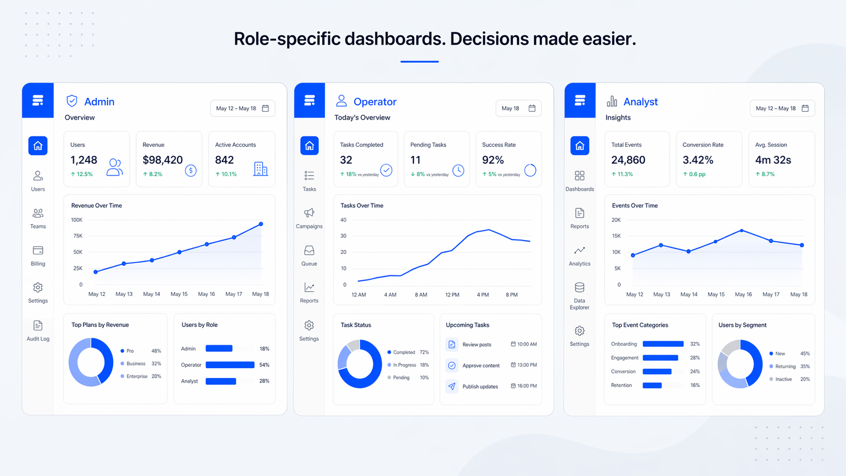
    Role-based views beat universal dashboards

    Every B2B SaaS product above a certain size has at least three user types on the same data. We design for that reality instead of against it.

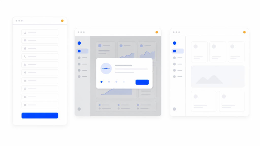
    The pattern we use most often: same data source, different primary view per role, shared detail views underneath. The admin sees system health first. The operator sees a daily task queue first. The analyst sees a time-range picker first. All three can drill into the same detail screens when they need to.

    Progressive disclosure matters more here than in B2C. Power users want the advanced filters, but showing them to the 60% of users who don't need them increases time-to-insight by about 35%. Hide the advanced tools one layer down. Users who need them find them. Users who don't stay out of their own way.

    Admin, operator, and analyst dashboard variants sharing a common detail panel

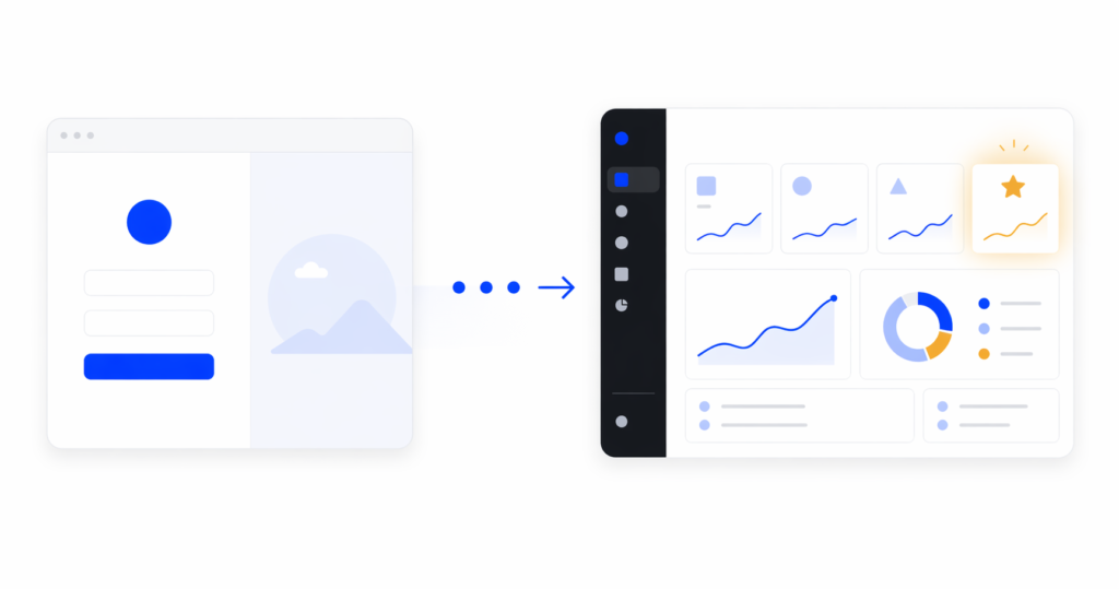
    What to strip: the most underused technique in dashboard design

    Adding metrics is easy. Cutting them is the part nobody wants to do. It's also the part that actually improves the product.

    Research from Baymard Institute and others consistently shows that dashboards exceeding around 12 KPIs see about 40% lower engagement. Working memory handles five to nine items at a time. A dashboard with 20 widgets is not a dashboard, it's a data dump.

    Our rule when we redesign a dashboard: if a user can't name the specific action a metric is tied to within five seconds, we cut it. On the RecurPost redesign, that rule moved the main dashboard from around 18 widgets to eight. The team was nervous about it. Activation on the new dashboard went up inside the first month because users could finally see what mattered.

    [HUMAN INPUT NEEDED: confirm the exact activation lift number for RecurPost dashboard widgets reduction, approximate figure used above]

    Information hierarchy that actually works

    The hierarchy in a good B2B dashboard is not a design decision, it's a reading order. Users scan roughly in an F-pattern, which means the top-left holds the most expensive visual real estate in the product.

    Put the primary KPI there. Put the secondary KPIs along the top row. Push the detail charts into the middle and the configuration or filter controls into the right rail or collapsed panels. Empty space is not wasted space. It's how users find the primary metric in under two seconds.

    Color hierarchy is the part most teams get wrong. Red, yellow, green for status without any supporting icon or label fails about 8% of users with color vision differences and also fails everyone on a bad monitor. We pair every status color with a short text label or an icon. "At risk" beats a yellow dot.

    F-pattern scanning path applied to a B2B dashboard layout

    Pick the chart that matches the question, not the one that looks impressive

    This is where a lot of B2B dashboards lose users. A 3D donut chart looks like a design decision. It's actually a comprehension tax.

    Our short list, based on what users can read fastest:

    • Bar charts for comparison between categories. Easy to read, about twice as accurate as pie or donut charts for length comparisons.
    • Line charts for trends over time. One line per series, three series maximum per chart, otherwise it becomes a spaghetti problem.
    • Single numbers with a delta for the hero KPIs. "$42,100 MRR, up 8% this month" is faster to read than any chart.
    • Tables for detail views where users need to sort, filter, and export. Charts are not always the right answer.

    Avoid pie charts for anything with more than three segments. Avoid stacked area charts for anything users need to compare precisely. If the chart makes the user pause to figure out what they're looking at, it's the wrong chart.

    The common mistakes we see in B2B dashboards

    These are the five things we flag first in every dashboard audit. Fixing any two of them usually moves activation.

    1. One dashboard for every role. The fastest way to make everyone feel mildly disappointed.
    2. Color-only status indicators. Fails the user on accessibility and fails them on a projector.
    3. Real-time everything. Costs four times more to maintain than batch refresh, and about 8% of dashboards actually need it.
    4. Drill-down on every number. Users who click, load, and scan three layers deep are users who have given up on the top-level view.
    5. No empty states. A new user opens the dashboard and sees zero charts. They assume the product is broken. Empty states should guide the first action, not apologize for missing data.

    [HUMAN INPUT NEEDED: add a before/after screenshot from an internal dashboard redesign, one example from a SaaS audit]

    Five common dashboard design mistakes shown as small illustrations

    FAQ

    What's the difference between B2B and B2C dashboards?

    B2C dashboards usually serve one user type with one job. B2B dashboards almost always serve multiple roles, have permission rules attached to the data, and are used by people who were assigned the tool rather than people who chose it. That last part changes everything about how forgiving a B2B dashboard has to be.

    How many metrics should a B2B dashboard show?

    Five to seven primary metrics on the main view, with everything else pushed into secondary tabs or drill-down panels. If you have more than nine widgets competing for the top of the screen, you're asking users to do the prioritization work you should have done for them.

    Should B2B dashboards be user-customizable?

    Usually no, not for the main view. Customization is a feature that looks good in a demo and gets used by about 10% of users. Design a strong default for each role first. Add rearrangement or widget-level personalization only after the default has stabilized.

    What tools do we use for B2B dashboard design?

    Figma for UI design, Maze or user interviews for validation, and real component libraries in the client's codebase for handoff. The tool matters less than the process. A dashboard prototyped in Figma without data edge cases will ship with broken states.

    How long does a B2B dashboard redesign take?

    A full redesign from audit to developer handoff typically takes four to eight weeks depending on how many roles and how much historical data is involved. Audit is usually one to two weeks. New IA and wireframes, two to three weeks. UI and handoff, two to three weeks.

    How do you test a dashboard before launch?

    Usability tests with three to five users per role, watching them answer the actual decision questions the dashboard was built for. If they can't answer within the first 30 seconds, the hierarchy is wrong. We test the empty state, the overloaded state, and the role-switched state separately, because those are the three places dashboards usually break.

    Ready to see where your dashboard leaks users?

    A good B2B SaaS dashboard doesn't try to do more. It removes everything that isn't helping a specific user make a specific decision. That's the hard part, and it's the part we spend most of the project on.

    If your team is staring at a dashboard that looks full and feels empty, a structured audit usually surfaces the fix faster than another round of internal debates. You can see how we approach SaaS product work on our portfolio, or read our related piece on SaaS onboarding design for the upstream view of what users do before they hit the dashboard. When you're ready, talk to our team about a dashboard audit for your product.

  • SaaS onboarding design: why most flows fail and how to fix yours

    Most SaaS teams spend weeks polishing the dashboard and a weekend on the onboarding flow. That ratio is upside down. In our experience, onboarding is where 40-60% of new signups quietly leave, and no amount of feature work fixes that gap. We’ve rebuilt onboarding for products like RecurPost and Upmetrics, and the pattern is always the same: teams add a tour on top of a confusing flow instead of fixing the flow itself. This guide walks through what SaaS onboarding design actually is, the framework we use with clients, the patterns that move activation, and the mistakes we see most often. If you’re a SaaS founder or product lead wondering why your signup-to-paid conversion is flat, the answer usually lives here.

    What SaaS onboarding design actually means

    SaaS onboarding design is the visual, interaction, and flow-level work that gets a new user from signup to their first real win with your product. It’s not a product tour. It’s not a checklist. Those are tools inside the bigger job.

    The mistake most teams make is treating onboarding as a layer you add at the end, usually a tooltip tour wired up with a third-party tool. That almost never works. A tour on top of a badly structured flow just makes the confusion slightly more narrated.

    Good onboarding design covers four things: how the user enters (signup, empty states, defaults), what they see first (information architecture, visual hierarchy), how the product guides the next action (contextual prompts, not modal pop-ups), and how they know they’ve succeeded (feedback, progress, first-value confirmation). Get those four right and you rarely need a separate tour.

    If this sounds like a product design problem more than a growth-team problem, that’s because it is. That’s why we handle it as part of SaaS UI/UX design services, not as a bolted-on growth project.

    Why onboarding, not features, decides retention

    Here’s something we’ve seen across SaaS redesigns: users almost never leave because a feature is missing. They leave because they never understood the product well enough to need that feature.

    Research from Nielsen Norman Group on user onboarding is consistent on this point. Roughly 40 to 60% of signups never come back after the first session. That’s not a product gap. That’s an onboarding gap.

    When we redesigned onboarding for RecurPost, a social media scheduling platform, onboarding completion went up 45% and recurring post usage rose 22%. We didn’t add new features. We restructured the path from signup to first scheduled post so the “aha moment” came sooner. On Upmetrics, a business planning SaaS, simplifying the same path lifted onboarding completion by 38% and feature adoption by 27%.

    The takeaway we push with founders is uncomfortable but true: if your activation rate is low, your roadmap is probably wrong. You’re likely building features for the 30% who stuck around instead of fixing the path for the 70% who didn’t.

    The Onboarding Fix Method we use with SaaS clients

    We run every onboarding redesign through the same four stages. This is the Onboarding Fix Method:

    1. Entry. Signup flow, field count, welcome screen, and role/use-case routing. Everything that happens before the user sees the actual product.
    2. First action. The single most important thing the user should do in their first session. Not a tour. One concrete action that starts to configure the product for them.
    3. First value. The moment the product does something useful for the user. The output, the report, the first scheduled post, the first imported dataset. This is the aha moment.
    4. Retention. How the product pulls the user back for session two, three, and four. Without this stage, activation doesn’t translate to revenue.

    Most teams design stage 1 well, skip stage 2 and 3, and call email drips “retention.” That’s why redesigns that only touch the welcome screen rarely move the needle. You have to fix all four stages because they compound.

    SaaS onboarding design patterns that actually move activation

    There are dozens of lists of “onboarding patterns.” Most are the same six items in different order. Here are the ones we actually use in client work, along with our POV on when each fits.

    Minimal signup, deferred commitment

    Ask for the minimum information needed to start. Email and password, ideally with SSO. Anything else goes after the user has seen value, not before. Figma’s browser-first signup is the canonical example. You start designing before you save. Most B2B SaaS products ask for role, company size, and phone number at signup and wonder why their completion rate is 60%.

    Role and use-case routing

    This is one microsurvey on the welcome screen that branches the onboarding path based on what the user is actually here to do. A solo founder and an enterprise admin don’t need the same first-run experience. In our experience, this one decision has a bigger activation impact than five tooltip improvements combined. The Baymard Institute’s research on form usability backs this up: every unneeded field is a drop-off risk, so a branching survey that earns its fields outperforms a static form that doesn’t.

    Progressive disclosure

    Show the core loop first. Hide settings, integrations, admin panels, and edge cases until the user asks for them. If your left nav has 14 items on day one, new users freeze. We almost always cut the first-session navigation in half during a redesign.

    Contextual guidance over modal tours

    Contextual guidance means a tooltip appears when the user is about to take an action, not when they log in. Modal tours interrupt. Contextual prompts teach. If you must include a walkthrough, cap it at three to five steps and always let the user skip.

    Smart onboarding checklists

    A good checklist auto-completes steps the user has already done. If they imported data before the “Import data” step, that box should already be checked. Forcing people to redo work is the fastest way to make them abandon. Checklists also work better when they’re persistent but collapsible, not a blocking modal.

    Empty states as onboarding real estate

    We’ll cover this in its own section because most teams underuse it.

    First-value feedback

    The moment the user completes the first meaningful action, the product should visibly confirm it. A toast that says “Saved” isn’t enough. Show the result. Notion’s first document renders the moment you type. Linear shows the issue in the list the second you create it. That visible result is the activation.

    Before

    After

    Mobile onboarding is a different problem

    Most SaaS onboarding writing assumes desktop. If your product has a mobile app or a significant mobile web share, copy-pasting desktop patterns will hurt you.

    Mobile onboarding constraints are real. Less screen space means fewer tooltip anchors. Input is slower, so every form field costs more. Push notification permission is the highest-stakes decision in the flow and most teams ask for it at the wrong moment.

    Our rule for mobile: never ask for permissions, subscriptions, or account details before the user has seen value. Show the product first. The push permission prompt should come after a moment where the user would genuinely want to be notified, not on screen two of the app.

    We’ve seen mobile onboarding completion double just by moving the permissions screen three steps later in the flow. For a good example of mobile-first onboarding thinking, our SaaS redesign case studies include mobile products like World 11 where screen-by-screen sequencing was the main design problem.

    Empty states are underrated onboarding real estate

    An empty state is the screen a user sees when they have no data yet. It’s the dashboard on day one, the projects list before the first project, the reports page before the first report.

    Most SaaS products treat empty states as placeholder screens. The word “empty” does most of the work, with maybe a sad icon and a “Create your first X” button. That’s a huge missed opportunity.

    In 2026, the best SaaS products use empty states as their primary onboarding surface. Notion is the clearest example. The empty document isn’t empty. It’s a warm prompt, a list of slash commands, template suggestions, and a single clear next action. The “empty” screen is doing more onboarding work than any tour could.

    Our Onboarding Fix Method puts empty states in the “first action” stage for a reason. They’re the surface where the user actually tries the product. If your empty state just says “No data yet,” you’re skipping the moment where onboarding matters most.

    A good empty state does three things: it tells the user what this screen will show once it has data, it gives them a concrete way to get there right now, and it shows an example of what the filled state looks like. That example is what makes the user understand the value.

    How to measure if your onboarding design is working

    Most onboarding writing pushes PLG metrics: activation rate, time-to-value, day-7 retention. Those matter. But from a design perspective, there are four more tactical metrics we watch during a redesign:

    • Drop-off per step. Where exactly in the flow do users leave? A 40% drop from step 3 to step 4 is a design signal, not a user signal. Something on step 4 is broken.
    • Time per step. If the average user spends 90 seconds on a step meant to take 10, that step is confusing, not engaging.
    • Click-to-value. How many clicks between signup and first real output? Under 10 is good. Over 20 is a redesign.
    • Return rate to first-value screen. Do users come back to the screen where they got their first win? If not, the win wasn’t memorable enough.

    These are the numbers a designer can act on. “Increase activation by 10%” isn’t a design brief. “Reduce drop-off between step 3 and step 4 from 40% to 15%” is.

    [HUMAN INPUT NEEDED: link to or screenshot of a dashboard or analytics view we’ve built for a client showing these funnel metrics, if available]

    Common SaaS onboarding design mistakes we see

    After enough redesigns, the same mistakes keep showing up. Here are five worth calling out.

    Mistake 1: Treating onboarding as a tour you add at the end

    This is the most common one. A confusing flow gets a tour bolted on, users click through it, then have no idea what to do. Fix: rebuild the flow so the tour isn’t needed. If the UI requires narration, the UI is the problem.

    Mistake 2: Asking for everything upfront

    Long signup forms with role, team size, use case, phone number, and industry. Each field drops completion by several percent. Fix: ask for email and password only. Everything else can come after first value.

    Mistake 3: Hiding the first action

    The user signs up and lands on a dashboard full of empty widgets, navigation, and no clear next step. Fix: design the first screen around one action, not ten. Every other option should be secondary.

    Mistake 4: Checklists that block instead of guide

    A modal checklist that users have to dismiss repeatedly is worse than no checklist. Fix: make it persistent but dismissible, auto-complete steps the user already did, and never block the main UI.

    Mistake 5: No confirmation of first value

    The user completes the key action and the product says nothing. No visible output, no “here’s what you just unlocked,” no forward momentum. Fix: design the moment after the first win as intentionally as the moment before it.

    FAQ

    What’s the difference between SaaS onboarding design and user onboarding?

    User onboarding is the broader process, including emails, customer success touchpoints, and documentation. SaaS onboarding design is specifically the in-product experience: the UI, flow, and interaction work that gets a new user to first value. In our work, we focus on the in-product design because it’s the part with the highest leverage and the one teams under-invest in.

    How long should a SaaS onboarding flow be?

    Shorter than you think. Under five minutes from signup to first value is a strong benchmark. Under two minutes is ideal for self-serve products. If your flow is longer, ask which steps could happen after first value instead of before.

    Do I need a product tour?

    Usually no. In our experience, products that require a tour have an information architecture problem a tour can’t fix. Contextual tooltips and well-designed empty states almost always outperform a modal walkthrough. If you do use a tour, cap it at three to five steps and make it skippable.

    What’s a realistic activation rate for a SaaS product?

    Benchmarks vary by category, but 40-60% activation within the first session is a reasonable target for self-serve SaaS. If you’re under 30%, the problem is rarely feature gaps. It’s onboarding design. That’s usually where we’d start a redesign.

    Should I personalize onboarding based on user role?

    Yes, if you have more than one clear user type. A microsurvey on the welcome screen that routes users to different onboarding paths is one of the highest-leverage design decisions you can make. One caveat: only ask what you’ll actually use to personalize. Asking without branching is friction without payoff.

    How often should I redesign onboarding?

    We recommend reviewing onboarding metrics every quarter and running a focused redesign when activation drops more than 10% from baseline or when the product adds a meaningfully new core flow. Full redesigns every 18-24 months are normal for growing products.

    Bringing it together

    Good SaaS onboarding design isn’t a tour, a checklist, or a welcome screen. It’s the whole path from signup to first real value, designed with the same care you put into your core product. The teams that treat onboarding as a first-class design problem see the activation lifts. The teams that treat it as a growth-tool integration usually don’t.

    If you’re looking at flat activation numbers and wondering where to start, the answer is almost always: rebuild the entry-to-first-value path before you add anything. Fix the flow, then decide whether you still need a tour. You usually won’t.

    If you want an outside read on where your onboarding is leaking users, talk to our team about a UX audit. We’ll map your current flow against the Onboarding Fix Method and show you the specific steps costing you activation.