How to conduct a UX audit that actually leads to fixes
Most UX audits we’ve reviewed end up as a PDF in a Drive folder. The team reads it once, nods at the findings, and goes back to shipping the same product. The mistake is treating the audit as a deliverable instead of a starting point.
After running UX audits on [HUMAN INPUT NEEDED: confirm exact number, suggestion: “30+”] SaaS products over the last few years, we’ve reshaped how we run them. The version that works treats the audit as a fix list, not a findings list. Every step is built to answer one question: what should the team ship next, and why.
This guide walks through how to conduct a UX audit using the seven-step process we use on SaaS products. It covers the heuristic evaluation, the prioritization, and the parts most teams skip.

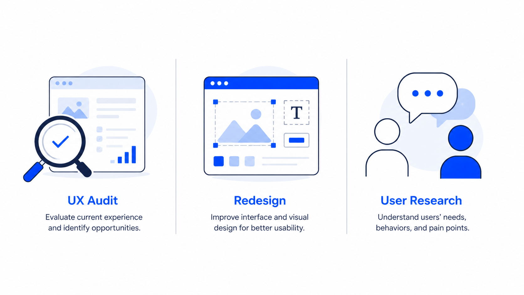
What a UX audit is, and what it isn’t
A UX audit is a structured review of your product against usability principles, real user behavior, and your own goals. The output is a list of issues, ranked by impact, with a recommended fix for each.
It is not a redesign brief. It is not a user research project. And it is not a visual polish review. We see teams confuse all three, then end up with a half-redesign that doesn’t fix the actual problem.
Here’s a quick way to tell them apart:
The mistake most teams make is jumping to a redesign when the audit hasn’t been done. You end up paying twice. Once to redesign without diagnosis, and again to fix what the redesign broke.
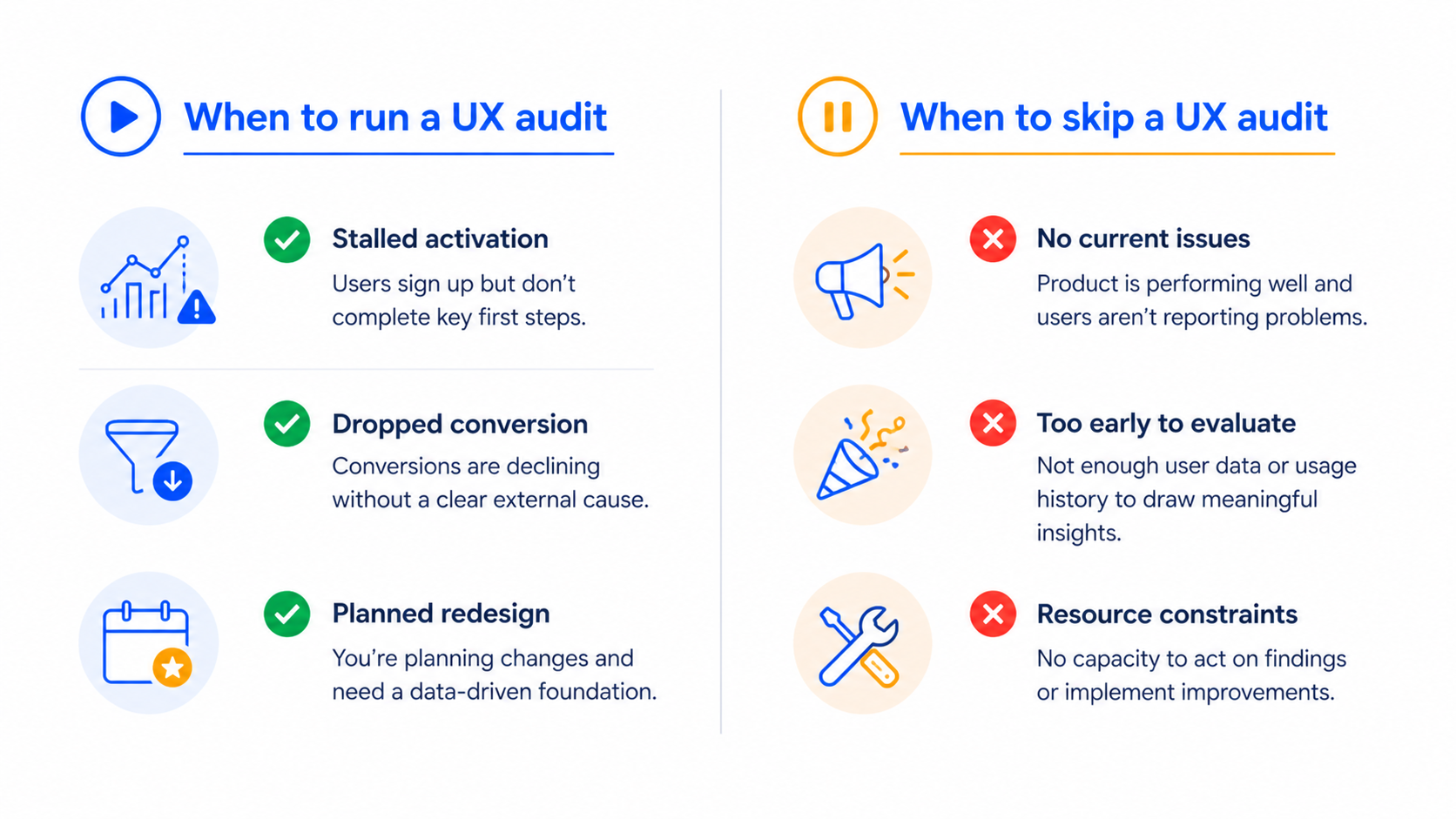
When a UX audit makes sense
We tell teams to run a UX audit when one of three things is happening:
We tell teams to skip an audit when:
- The product hasn’t reached enough users to generate behavioral data. You need real usage to find real friction. Run user interviews instead.
- The team already knows what’s broken but is using the audit as a stalling tactic to delay the redesign decision.
- A senior stakeholder wants the audit to validate a personal opinion. Audits don’t work as ammunition.
Frequency matters too. For early-stage SaaS shipping fast, we run a focused audit every quarter on the highest-traffic flows. For more mature products, every six months on the full surface is enough.
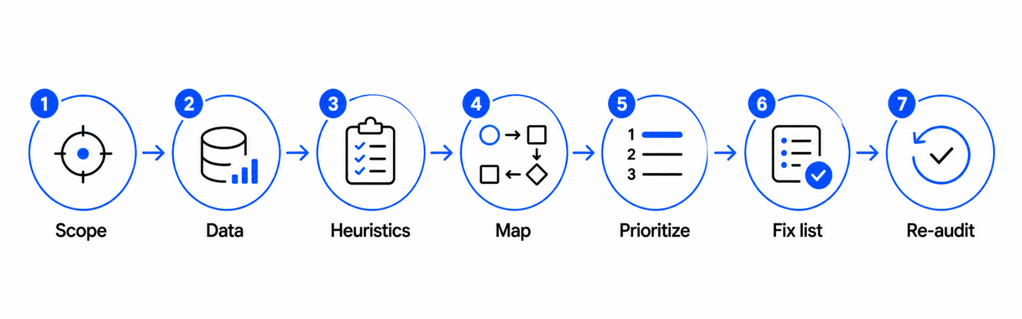
The 7-step UX audit process we use
Our process follows a simple sequence: define what you’re looking for, look for it systematically, and end with a prioritized list of fixes the team can ship. We use our UX Audit Framework, IA, User Flows, UI, and Microcopy, as the four lenses for evaluation.
Step One
Define the scope before you open a single screen
The biggest waste in UX audits is auditing the whole product when only one flow is broken. Before any review starts, we get clear on:
- The exact flow or surface in scope (signup, dashboard, billing, etc.)
- The user segment you’re auditing for (new users, power users, free vs. paid)
- The business outcome you want to influence (activation, retention, upgrade rate)
A focused audit on one flow takes one to two weeks. An unfocused audit on the whole product takes six and produces a report nobody reads.
Step Two
Pull the data so you don’t audit blind
A heuristic review without data is just opinion. Before we touch the interface, we pull:
- Funnel analytics for the flow in scope, ideally segmented by source and device
- Session recordings (FullStory, Hotjar, or LogRocket) of users hitting friction
- Recent support tickets tagged to the flow
- Any past user interviews or NPS comments on the area
The point isn’t to confirm what you already think. It’s to find where the data and the interface disagree. That gap is where the real issues live.
Step Three
Run a heuristic evaluation against the user flow, not the screen
Most teams run a heuristic evaluation by walking through screens one at a time. We run it by walking through user flows end to end, against Jakob Nielsen’s 10 usability heuristics.
The reason is simple: usability problems compound across screens. A single screen can pass a heuristic check and still leave the user lost three screens later. Auditing flow-by-flow surfaces the issues that screen-by-screen reviews miss.
For each step in the flow, we note:
- Which heuristic is being violated
- What the user is likely thinking at that moment
- The visible signal (cognitive load, dead-end, unclear next action)
Step Four
Map issues across IA, user flows, UI, and microcopy
We sort every issue we find into one of four buckets, in this order:
The order matters. Fixing UI before IA is decorative work. In our experience, 60 to 70% of the highest-impact issues live in IA and flow, while teams instinctively want to start with UI.
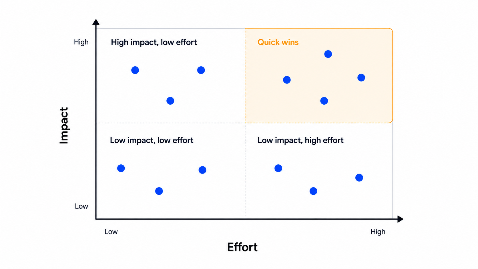
Step Five
Prioritize by impact and effort, not severity
Severity ratings (“critical”, “major”, “minor”) don’t help engineering teams decide what to ship next. Instead, we score each issue on two axes:
Then we sort by impact divided by effort. The top of the list is what ships next sprint. The bottom is what gets parked or skipped entirely.
Step Six
Write a fix list, not a findings list
A findings list says: “The signup flow has unclear validation messages.” A fix list says: “Replace inline validation copy on the signup form with the four messages shown below, and trigger them on blur instead of on submit.”
For each issue we hand to the team, we include:
- The specific screen and element affected
- The recommended fix, in enough detail that engineering can scope it
- A before-and-after annotation when the fix is visual
- The expected outcome the team should track
This is the deliverable that gets things shipped. A 60-page findings deck doesn’t.
Step Seven
Re-audit after the fixes ship
Most teams stop at the report. We track whether the fixes actually moved the metrics they were supposed to move. Two to four weeks after the fixes ship, we pull the same funnel data and check.
If activation went up, we know what worked. If it didn’t, we revisit the audit and figure out what we missed. This step is what turns the audit from a one-time exercise into a feedback loop.
How to prioritize what the audit finds
Even with impact-over-effort scoring, you’ll usually have 30 to 60 issues at the end of an audit, and engineering capacity for maybe 8 to 12 in a sprint. The rule we follow:
- Ship anything in the top quartile that affects the activation flow first
- Bundle small UI fixes into a single design pass instead of one ticket each
- Park anything that depends on a backend change you don’t have the appetite for
- Re-evaluate the parked list after the next round of fixes ships
This is also where we tell teams to resist the urge to fix everything. Shipping the top 10 issues will move metrics. Shipping all 60 will mostly produce churn in the codebase.
If your audit reveals that the underlying flow is broken at a structural level, that’s a redesign, not a fix list, because the playbook is different.
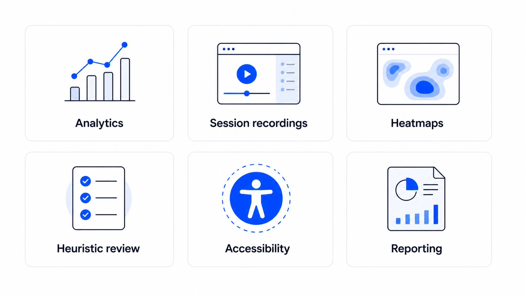
Tools we reach for during a UX audit
Tools won’t run the audit for you, but the right ones cut the time roughly in half. Here’s what we keep in rotation:
Funnel analytics
Mixpanel, Amplitude, or PostHog for the quantitative funnel and segment slicing. We start every audit with one of these open.
Session recordings
FullStory, Hotjar, or LogRocket. Watching ten recordings of users hitting the flow you’re auditing surfaces issues a heuristic review will miss.
Heatmaps
Hotjar or Microsoft Clarity for click and scroll patterns. Useful for landing pages and dashboards more than for transactional flows.
Heuristic review
a shared FigJam or Miro board with the 10 Nielsen heuristics as columns, and one sticky per issue we find. Keeps the team aligned on what’s actually a violation.
Accessibility check
axe DevTools or WAVE for the automated pass. We follow up with a manual keyboard-only walk-through, since automated tools catch 30 to 40% of accessibility issues at best.
Reporting
Notion or a shared Figma file with annotated screenshots. We’ve moved away from PDFs, the engineering team needs something they can comment on and ship from.
The pattern across all of these: pick the tool the team already uses, not the one with the best feature list. The best audit tool is the one your engineering team will actually open after the report lands.
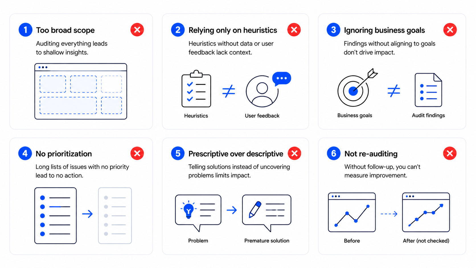
Common mistakes that make UX audits useless
These are the patterns we see most often when an audit fails to produce shipped fixes:
The thread across all of these is the same: most UX audits get treated as research, when they should be treated as the start of a release.
FAQ
How long does a UX audit take?
A focused audit on a single flow takes one to two weeks. A full-product audit takes four to six. Anything longer means the scope was too broad or the team is using the audit as a delay tactic.
How much does a UX audit cost?
Freelance auditors typically charge $1,500 to $3,000 for a single-flow audit. Agencies charge $6,000 to $20,000 depending on scope, depth, and whether the deliverable is a findings report or a fix-ready design pass.
Can I conduct a UX audit in-house?
Yes, if you have someone who can stay objective about a product they helped build. The risk in-house is that the team defends past decisions instead of finding issues. An external audit pairs well with internal product knowledge.
What’s the difference between a UX audit and usability testing?
A UX audit is a structured expert evaluation against usability principles and data, run by a designer. Usability testing observes real users completing tasks. The two work well together: the audit produces a hypothesis, usability testing validates the riskiest fixes.
How often should we run a UX audit?
For early-stage SaaS shipping weekly, run a scoped audit every quarter on the most important flow. For more mature products, run a full audit every six months and a focused one on any flow that shows a metric drop.
Should we audit before or after a redesign?
Always before. The audit tells you what to redesign and what to leave alone. Skipping the audit and starting straight from a redesign means you’re guessing at the problem.
Ready to find what’s blocking your users?
If your activation, conversion, or retention numbers are slipping and you can’t tell why, a structured UX audit is the fastest way to find out. Our team has run audits on SaaS products across Upmetrics, Reccurpost, CRMone and the deliverable is always a fix list, not a 60-page report.
Book a UX audit and we’ll come back with a prioritized list of what to fix and what to leave alone, in two weeks.
Leave a Reply