Mobile app navigation patterns: how to pick the right one (without guessing)
Most teams start a mobile app navigation conversation in the wrong place. They pick a tab bar versus hamburger debate before they’ve finished their information architecture. By the time the first screen ships, the navigation is fighting the product instead of supporting it.
After redesigning navigation for [HUMAN INPUT NEEDED: confirm number, suggestion: “20+”] mobile apps across SaaS, fintech, and consumer products, we keep seeing the same pattern. Teams shop for navigation styles instead of designing the structure underneath them. The hamburger versus bottom tabs question is almost always a symptom of unclear IA, not a real design decision.
This guide breaks down the eight mobile app navigation patterns we actually use, when each one fits, and a four-step process for picking the right one for your product. No screenshot zoo, no pros-and-cons tables that read like Wikipedia. Just what we’ve learned from shipping real navigation across products like RecurPost, World 11, and Bruno’s Barbers.
The mistake most teams make with mobile app navigation
The mistake is treating navigation as a UI question. It isn’t. Navigation is the visible output of your information architecture, and if the IA is fuzzy, the nav will be too.
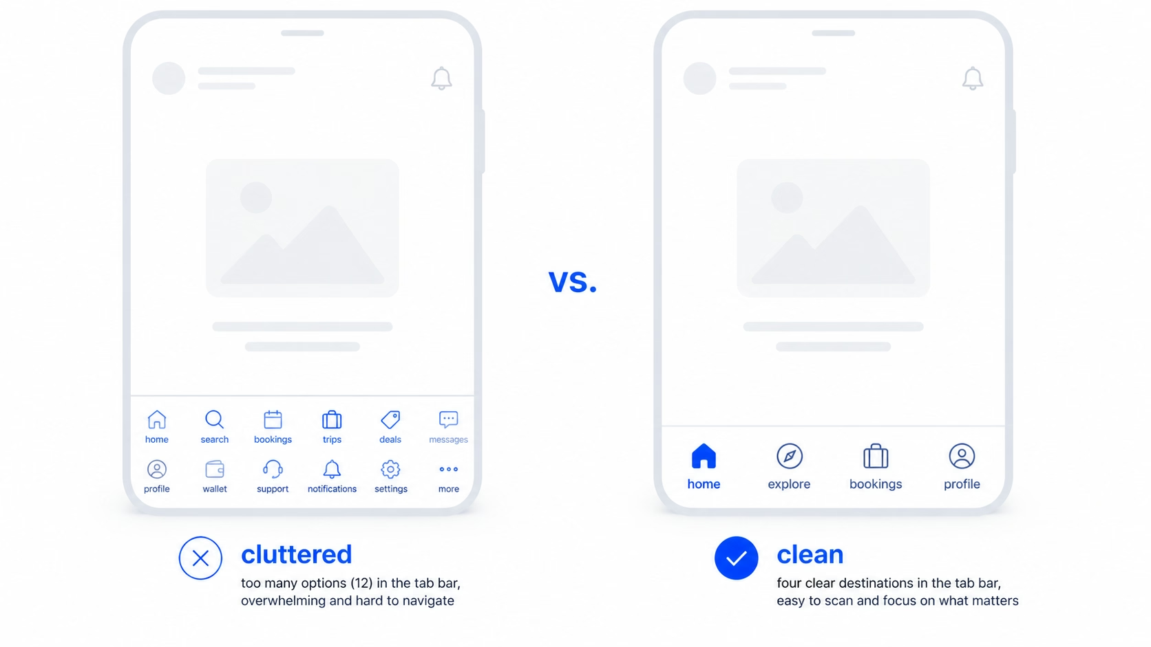
Here’s what we see almost every time a team comes to us with a “navigation problem”. They’ve got twelve features. They picked a bottom tab bar early because it looked clean. Now there are five tabs, the fifth one is “More”, and “More” hides everything users actually came to do. The team thinks the fix is switching to a hamburger menu. It isn’t.
A clean UI is not equal to good UX. A bottom tab bar can look great and still hide the three actions that drive activation. The real fix is going back to the IA: what are the destinations users move between, how often, and in what order. Once that’s clear, the pattern almost picks itself.
In our experience, the teams that get mobile navigation right do one thing first. They list destinations, not features. A destination is a place the user goes to do something repeatedly. A feature is anything you’ve shipped. Most apps have far fewer destinations than features, and that gap is where the cleaner nav lives.
The 8 mobile app navigation patterns we actually use
These are the patterns we reach for. Not every pattern that exists, just the ones that do real work in shipping products.
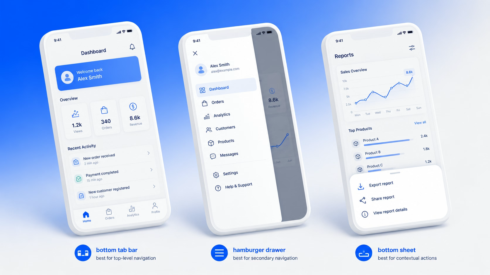
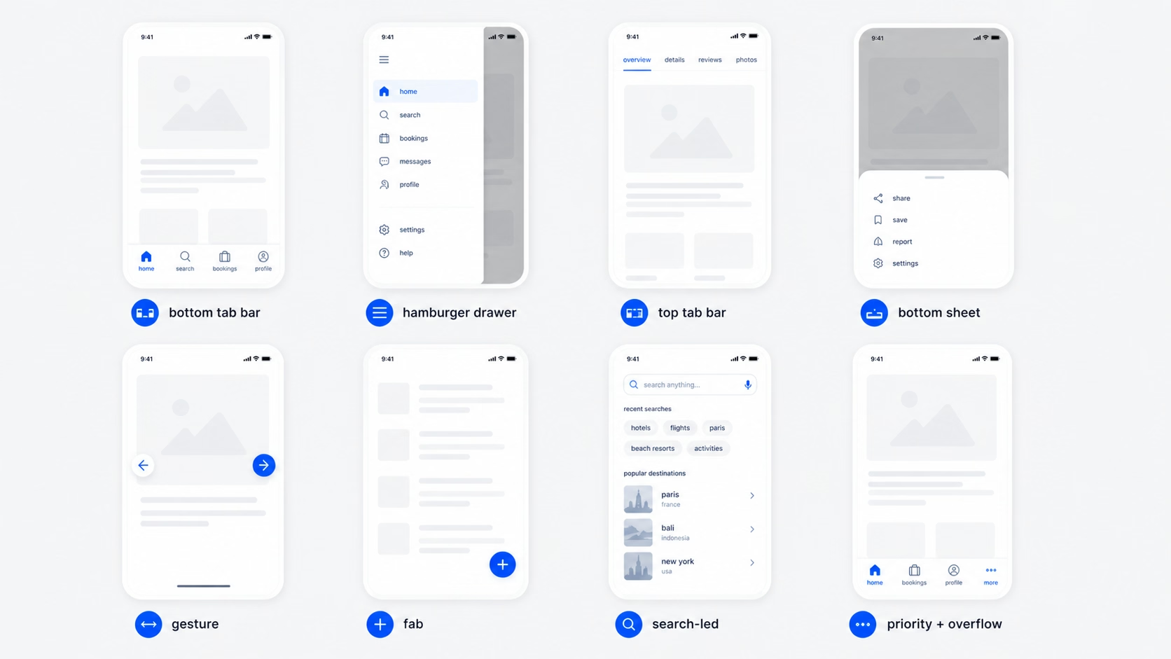
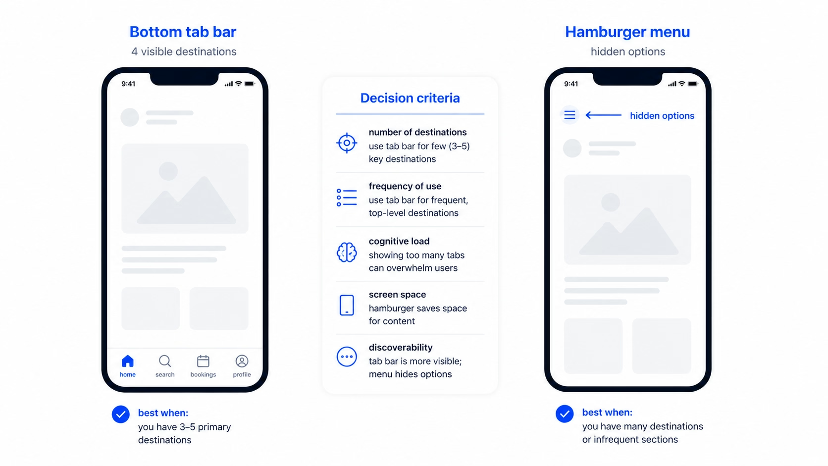
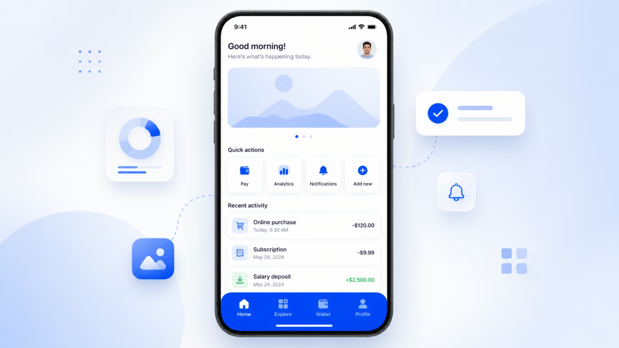
Bottom tab bar
A persistent bar at the bottom of the screen with three to five primary destinations. The standard for almost every consumer-grade app on iOS and Android, including Instagram, Spotify, and most banking apps.
When it works: the product has three to five destinations users move between regularly, and the destinations are roughly equal in importance. This is the safest default for SaaS apps with a clear core loop.
When it breaks: the product has more than five top-level destinations and you start jamming “More” tabs in. That’s a signal to rethink IA, not to add another tab.
Hamburger menu (drawer)
The three-line icon, usually top-left, that slides out a list of options. Common in productivity tools, email clients, and apps with a long tail of secondary actions.
When it works: as a secondary nav for settings, account, help, and rarely-used sections. Pairing a hamburger with a bottom tab bar is what NN/g calls a “combo” pattern, and it’s used in roughly 86% of cases where hidden navigation is involved.
When it breaks: as the only navigation. Hidden nav cuts engagement roughly in half because users don’t open what they can’t see. If your primary destinations live behind a hamburger, expect lower retention.
Top tab bar (segmented control)
A row of tabs at the top, often used inside a destination to switch between views (like “Posts / Reels / Tagged” on a profile page).
When it works: switching between filtered views of the same content. Two to four tabs is the sweet spot.
When it breaks: when teams use it as primary navigation. Top tabs are hard to reach with a thumb on a 6.7-inch phone, which is most of the market now.
Bottom sheet
A panel that slides up from the bottom of the screen. It can be persistent (a permanent peek) or modal (triggered by an action). Maps apps and music players use this heavily.
When it works: surfacing contextual actions or content without leaving the current screen. Great for product detail views, filters, and quick actions.
When it breaks: when used as a substitute for a real navigation hierarchy. A bottom sheet is for actions on the current view, not for moving between sections.
Gesture-based navigation
Swipes, edge gestures, and long-press as primary interactions. Used heavily in iOS for back navigation and in apps like Tinder where the gesture is the product.
When it works: when the gesture maps to a real-world metaphor users already understand (swipe to dismiss, swipe to delete, pull to refresh).
When it breaks: when you build a hidden gesture with no visual affordance. Users won’t discover it, and the ones who do will forget. Gestures should support navigation, not replace it.
Floating action button (FAB)
A circular button hovering above the content, used for the single most important action in the app. Material Design’s signature pattern. Gmail’s compose button is the classic example.
When it works: when there’s one action that’s clearly more important than everything else and is taken from many screens. Compose, create, post.
When it breaks: when teams stuff three FABs into one screen, or use it for a secondary action. One FAB, one job, or skip it.
Search-led navigation
Search as the primary way to find content, often with a prominent search bar at the top of the home screen. Used in apps with deep catalogs, like ecommerce, streaming, and travel.
When it works: when users come in with intent and the catalog is too large for category browsing. If your catalog has more than a few hundred items, search needs to be a first-class destination.
When it breaks: when search is hidden behind an icon and used as a fallback. If users need search, give it real estate.
Priority+ pattern (overflow)
Show the most important nav items, hide the rest behind a “more” button that expands or opens a sheet. A way to keep a tab bar at five items while still surfacing access to the long tail.
When it works: when you genuinely have a long tail of secondary destinations and you want the primary five to stay clean. Pairs well with a bottom tab bar.
When it breaks: when “More” becomes a dumping ground and the items behind it never get touched. If 30% of your users never tap “More”, the items there might not need to exist at all.
Bottom tab bar vs hamburger menu: when each one wins
This is the most-searched mobile navigation question we get, so it’s worth answering directly.
The short answer: use a bottom tab bar for primary destinations users hit often. Use a hamburger menu for secondary nav users hit rarely. In most apps, you’ll use both.
The longer answer is about visibility. A bottom tab bar keeps three to five destinations always visible. A hamburger menu hides everything behind one icon. The trade-off is screen space versus discoverability, and discoverability almost always wins for the actions that matter.
Here’s how we pick between them on real projects:
Use a tab bar
when the product has 3-5 clear core destinations and users return to them often. Examples: a SaaS dashboard with Home, Inbox, Library, Settings; a fintech app with Accounts, Transfer, Cards, Profile.
Use a hamburger
when most of the app is one core destination and the rest is settings, help, account, and edge cases. Examples: a focused content tool, a single-purpose calculator, a CMS-style editor.
Use both
when you have 3-5 primary destinations and a long tail of secondary nav. This is most apps once they scale. Tab bar for the primary, hamburger for the rest.
The mistake most teams make is using a hamburger as primary navigation because they couldn’t decide what was important. A hamburger is not a way to avoid prioritization. If you can’t pick five primary destinations, that’s a product clarity problem, not a navigation one.
How to pick the right navigation pattern in 4 steps
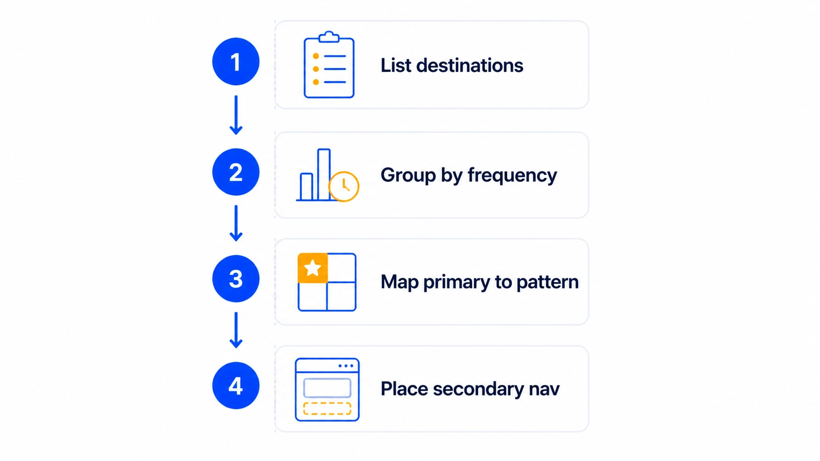
Here’s the process we run before picking a pattern. It usually takes a couple of hours for a single product and saves weeks of redesign later.
1
Step One
List your destinations, not your features
A destination is a place the user goes to do a recurring job. A feature is anything you’ve shipped. Write down every destination in your app on one piece of paper. Most teams find they have far fewer than they thought.
For a typical SaaS product, this might be: Home, Library, Create, Inbox, Settings. Five destinations. Notice that “Create” is one entry, not seven, even if you have seven different create flows underneath it.
2
Step Two
Group by frequency of use
For each destination, mark how often a typical user hits it. Daily, weekly, monthly, or rarely. This data should come from analytics, not opinion. If you don’t have data yet, base it on the jobs the user is hiring your product to do.
The destinations users hit daily or weekly are your primary nav candidates. Monthly and rarely belong in secondary nav.
3
Step Three
Map the primary 3-5 to a pattern
Take your daily and weekly destinations. If there are three to five of them, a bottom tab bar is your default. If there are one or two, you might not need a primary nav at all, just a single screen with smart in-context actions.
If there are six or more, that’s the IA signal we mentioned earlier. Either two of them are actually the same destination wearing different hats, or you’re confusing features with destinations again. Go back to step one.
4
Step Four
Decide where the secondary nav goes
The monthly and rarely destinations don’t disappear. They go in a hamburger, a settings drawer, or a profile menu. The rule is: secondary nav should be reachable in two taps from any primary destination, but it shouldn’t compete for attention with the primary five.
This four-step process maps to the design decisions we make on every project. It also forces the conversation upstream into IA, where the real decisions live.
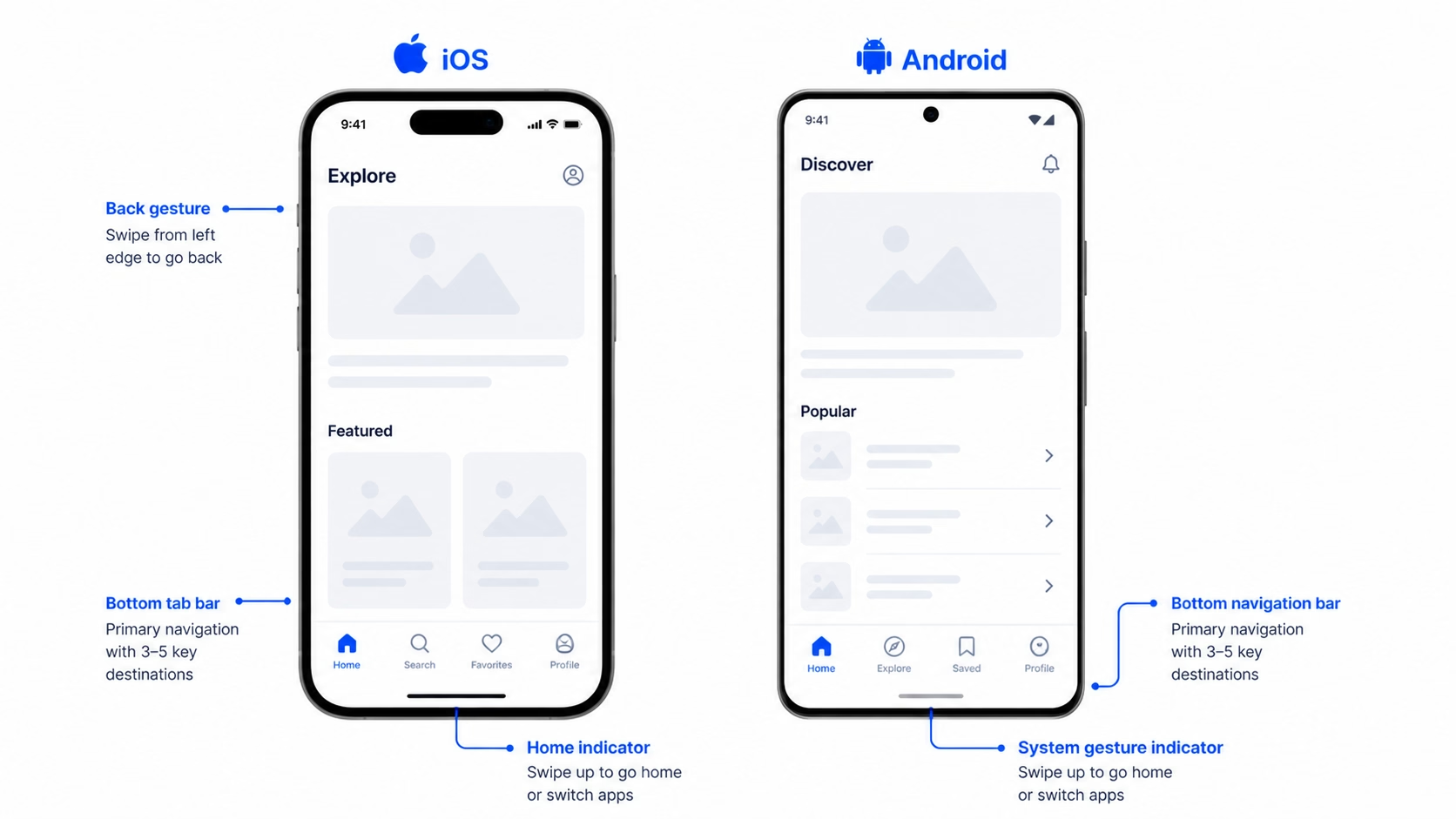
iOS vs Android: navigation conventions to follow (and break)
Both platforms have hardened conventions. Following them gets you 80% of the way to good navigation for free, because users already know how the controls work.
For iOS, the conventions are: tab bar at the bottom, back gesture from the left edge, modal sheets that slide up, and a navigation bar at the top with title and optional left/right actions. Apple’s Human Interface Guidelines lay this out clearly, and breaking from it usually costs more than it gains.
For Android, the conventions are: bottom navigation bar (Material 3 has officially moved away from top tabs as primary), system back via gesture or button, and a top app bar with title and actions. Material Design’s guidance has converged with iOS over the last few releases, which is why most cross-platform apps now look broadly similar at the navigation layer.
The places where breaking convention is okay are usually brand-led products where the navigation is part of the experience. A meditation app with a single circular control instead of a tab bar can work, because the product is about focus. A banking app with a custom gesture-based menu cannot, because users are anxious and need predictability.
A practical baseline we use on every project: minimum tap target of 44 points on iOS and 48 dp on Android, label every nav item (icon-only nav loses on accessibility and discoverability), and keep nav placement consistent across screens. Different nav per screen breaks the user’s mental model of where they are.
Common mobile app navigation mistakes (and how to fix them)
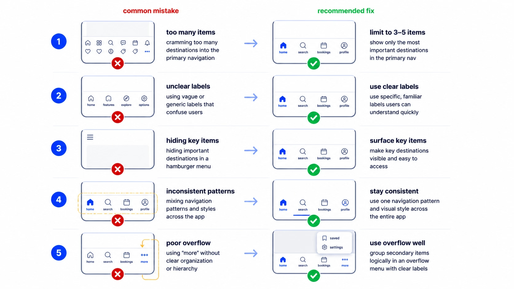
Five mistakes we see almost every audit. Each one is fixable without a rewrite.
1. Five tabs and one of them is “More”. The “More” tab is a sign your IA hasn’t been finished. The fix is to merge two real tabs into one (often Settings + Profile) and promote the most-used item out of “More” into the primary five. If “More” still feels needed, switch to the priority+ pattern with a clear overflow icon.
2. Hamburger as the only navigation. Engagement on hidden nav drops off fast. The fix is to identify your top three to five destinations and pull them into a bottom tab bar. Leave the hamburger for everything else. We’ve seen this single change move daily active engagement double-digit percentages on products we’ve audited.
3. Inconsistent nav across screens. A bottom tab bar on the home screen, no tab bar on the detail screen, a different nav on the settings screen. Users lose their sense of place. The fix is to keep the primary nav visible across all main screens. Hide it only on full-screen flows like onboarding or checkout.
4. Hidden gestures with no affordance. A swipe-from-the-edge action that nobody finds. If a gesture matters, give it a visual hint, at least on first use. A small chevron, a tutorial overlay, or a subtle bounce animation. Hidden gestures with no affordance get used by less than 5% of users in the testing we’ve done.
5. Tap targets that are too small. Cramming five tabs plus icons plus labels into a thin bar. The fix is to either drop a tab or drop the labels. We don’t recommend dropping labels, so usually it’s the tab. If your tab bar feels cramped, your IA is over-stuffed.
If you’re seeing two or more of these in your product, it’s worth running a focused UX audit on the navigation surface specifically. The fixes are usually smaller than the redesign your team is bracing for.
How to test if your mobile navigation actually works
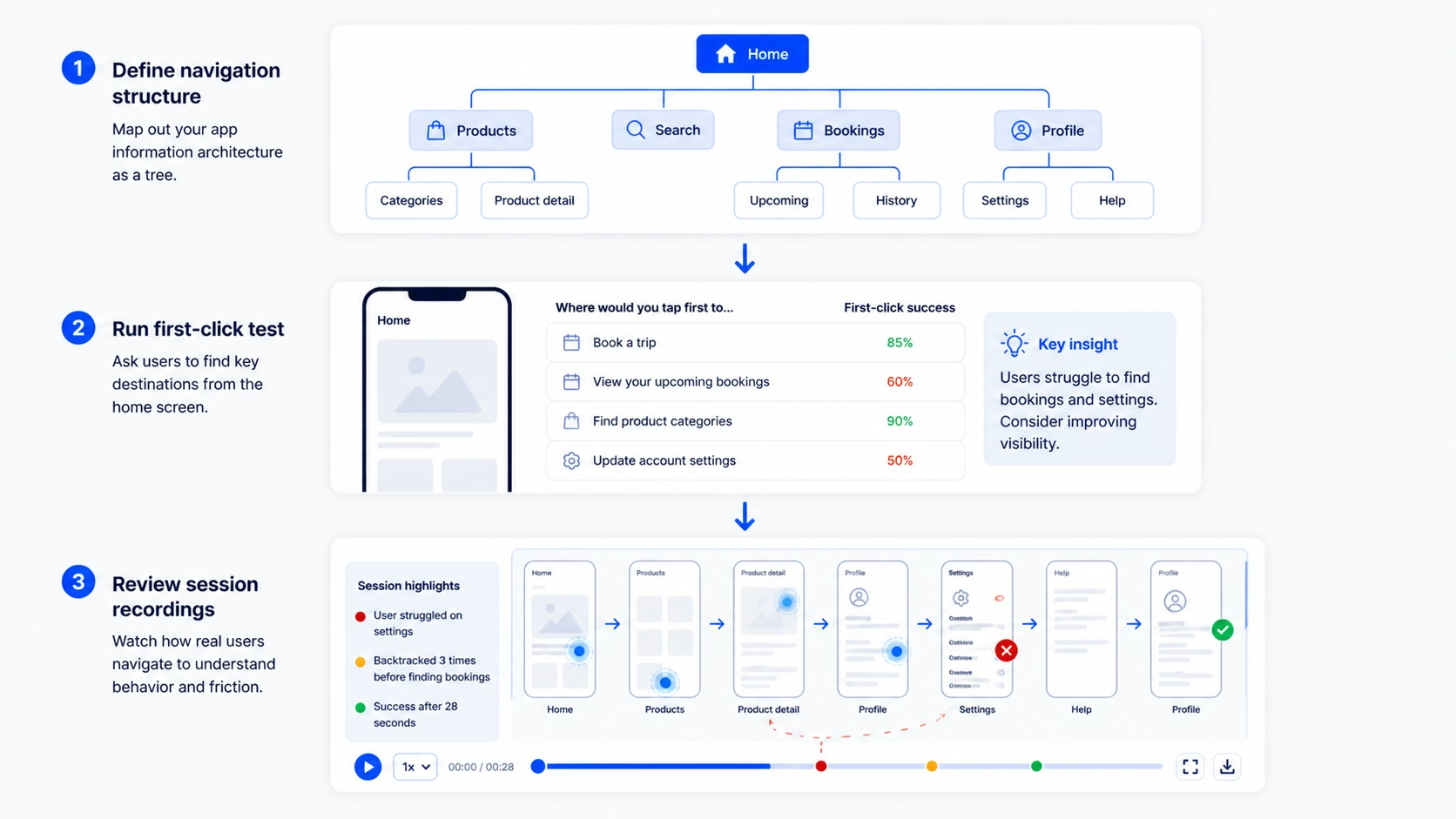
Picking a pattern is half the work. Validating it is the other half. Here’s the testing stack we use, in order of cost.
Tree testing comes first. Strip the visual design out and test just the IA structure. Tools like Treejack or Maze let you give users a task (“find your billing info”) and see how they navigate the structure. If they fail at the tree level, no amount of UI polish will save the navigation.
First-click testing comes next. On a static screen, ask users where they’d tap to do a specific job. If more than 30% click the wrong place, the labels or icons are misleading. NN/g research on first-click accuracy shows it’s one of the strongest predictors of overall task success, so it’s cheap, fast, and worth running early.
Time-to-task on the top three user goals is the closest thing to a real-world measurement. Time how long it takes users to complete the three most common tasks in your app. If any of them take more than 10-15 seconds of navigation time, you have a discoverability problem. Users who can’t find what they’re looking for in that window typically abandon.
Session recordings are the cheapest signal once the product is live. Watch ten users hit the navigation in real use. You’ll see hesitations, wrong taps, and moments where someone opens a hamburger and immediately closes it. Those are the gaps your IA didn’t anticipate.
A note on metrics: don’t use raw engagement on a nav item as a signal of success. A tab might be tapped a lot because users keep landing there by accident. Always pair engagement with task completion to know whether nav is helping or hurting.
FAQ
What’s the best mobile app navigation pattern for a SaaS app?
For most SaaS apps, a bottom tab bar with three to five primary destinations plus a hamburger or profile menu for secondary nav is the safest default. Tab bar handles the daily and weekly destinations, hamburger handles settings, billing, account, and edge cases. The exact split depends on your IA, not your app type.
How many tabs should a bottom navigation have?
Three to five. Below three, a tab bar is overkill, and you can usually get away with a single home screen plus contextual actions. Above five, the targets get too small and users start tapping wrong icons. If you have six destinations that all feel primary, two of them are probably the same destination in disguise.
Is the hamburger menu still acceptable in 2026?
Yes, as secondary navigation. It’s no longer acceptable as primary navigation for any app where engagement matters. Hidden nav cuts engagement roughly in half because users don’t open what they can’t see. Pair it with a bottom tab bar for primary destinations.
What’s the difference between a bottom tab bar and a bottom sheet?
A bottom tab bar is persistent navigation between top-level destinations. A bottom sheet is a contextual panel that slides up to surface actions or content related to the current screen. Both live at the bottom, but the tab bar is for navigation, the bottom sheet is for actions.
Should mobile apps follow iOS or Android navigation conventions?
Both. If you’re shipping on both platforms, follow each platform’s native conventions where it matters: tab bar position, back gestures, sheet behavior. The shared layer (your screen layouts, component design, content) can be consistent. The platform layer should match user expectations.
How do I know if my mobile app navigation is failing?
Three signals: time-to-task is over 15 seconds for top user goals, support tickets complain about “can’t find” things, or session recordings show users hesitating or backing out of the nav frequently. Any one of those is enough to run a focused navigation audit.
Ready to fix your mobile app navigation?
Most navigation problems we see are IA problems wearing a UI costume. The fix isn’t a new pattern, it’s a sharper structure underneath. If your team is debating tab bar versus hamburger, that’s usually a sign the question one level up hasn’t been answered yet.
We’ve done this work for products at every stage, from pre-launch MVPs to scaled SaaS apps. If you’re sitting on a navigation problem that hasn’t gotten easier with another round of mockups, it’s worth a conversation. If the navigation is part of a broader rethink, our team handles full product redesigns end-to-end, IA through final handoff.

Leave a Reply